Streamlining the website of a life science industry giant
In a fast-paced industry like diagnostics, even the largest global players are falling behind when it comes to their website and user experience. My client (whose name I cannot disclose) operates in 150 countries around the globe, providing thousands of products and services for diagnostics, life science research, food, environmental and industrial testing.
Due to their continuous acquisitions, the corporate website has become more of a giant patchwork rather than a consistent, streamlined experience. I was brought on board to help them understand what needs to be improved and craft new solutions for their existing and future customers.
- Project by
- Notch
- My role
- Project lead / UX Research & Design
- Duration
- 6 months (ongoing)
- Key tools
- Figma, Gloomaps, Zoom, Keynote
Projects highlights
The following details are carefully selected highlights of a much larger project to showcase my involvement while adhering to strict confidentiality. As I am not a scientist, I was also supported by a brilliant team of scientific writers and marketers every step of the way.
Starting with structural changes
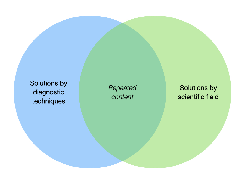
Apart from the actual Products section, there were two main areas on the website: the different techniques you can perform with their instruments and the different fields and industries you can use them for. The huge overlap between the two sections prompted us to consider consolidating them.
During the early stages of the project, we worked closely with internal stakeholders from each business unit to hammer out the details of this new combined section. Following a series of usability tests with customers on the initial navigation prototypes, the final Applications section was born.
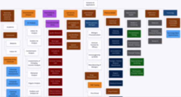
Mapping out the new structure
My next step was to identify what this merger would mean in terms of content and functionality across the proposed new section. I colour-coded the proposed sitemap to visualise how many different page layouts exist on the current website. Each colour represents a completely different page template and functionality.
As the sitemap shows, simply combining these pages under one section would result in a slightly chaotic experience for users. My aim was to find out how we can improve these pages and create a consistent template that each business unit can follow in the future.
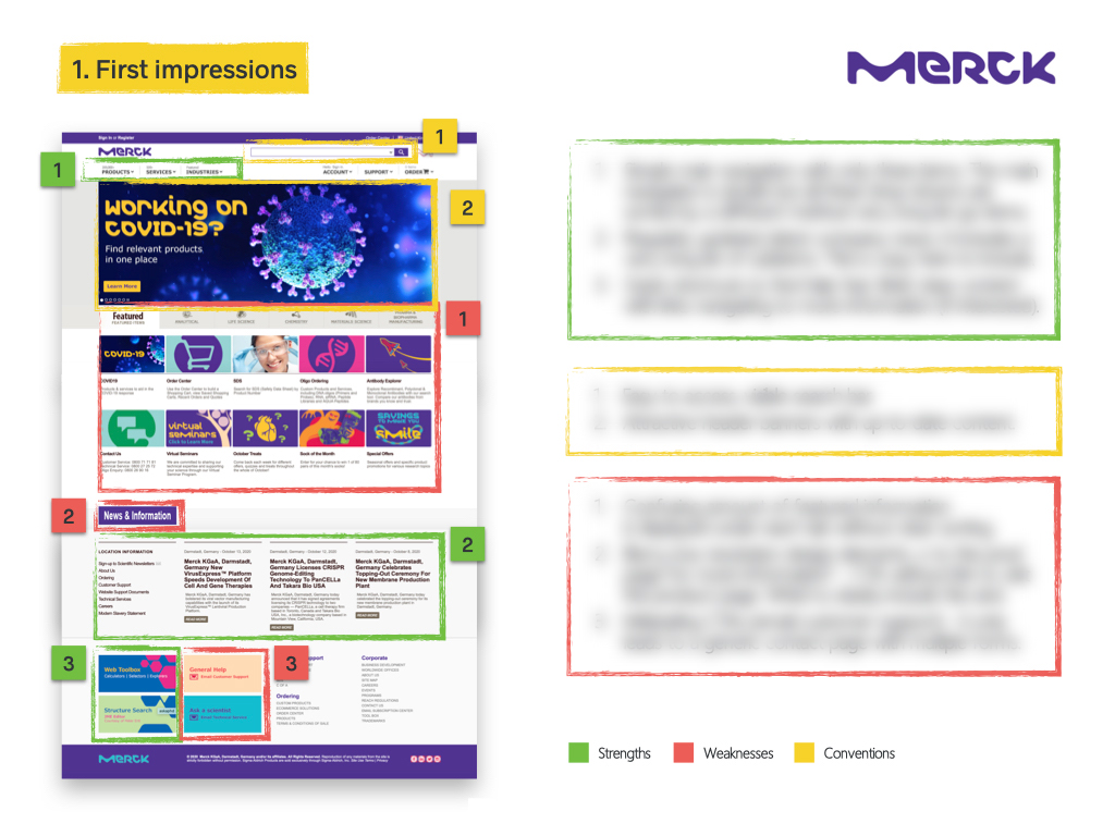
No one has it right in the industry
Once I had a good understanding of the existing solutions, I was interested to see how others are tackling the same challenges across the industry. I conducted an in-depth analysis of the key competitor websites, looking at their strengths, weaknesses and conventions I need to follow.
I was surprised to see that all global players are struggling to solve the same issue I was facing: showcasing an enormous product portfolio and content to support a large variety of audiences. At the moment, no one has it perfectly right, which means this is a great opportunity for my client to stand out in the market.
Commonalities across the globe
Given the number of industries my client operates in, it was crucial to talk to multiple stakeholders from each business unit and continent. These interviews helped me understand their different business objectives and the potential overlaps between audiences across segments.
Key insights that were relevant to each business unit and region:
- Show that we understand the customer’s workflow in the lab and have a solution for each step of their process
- Create a better connection between the application and product pages
- Provide easier access to the available pieces of educational content
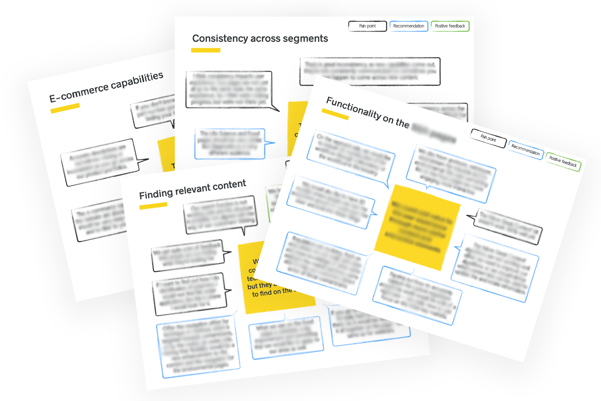
Key customer insights
To understand the goals and behaviours of potential and existing customers, we have also conducted in-depth customer interviews, followed by brief usability testing sessions on the existing website.
The outcomes of these interviews validated many of our initial stakeholder insights but also provided further important findings.
- Users tend to visit the application pages first to find the best product for their technique/scientific field
- They do not expect the website to be organised around their workflow but would appreciate a visual tool on pages
- They genuinely prefer browsing through cards with images rather than navigation dropdowns
- They are frustrated by not being able to find content and resources that pertain to a very specific topic
How might we...
Create a consistent experience across all the different levels and subpages?
Help users find all the technical and educational content that pertain to a specific topic?
Help users browse the products and services available for their field of science?
Modular template
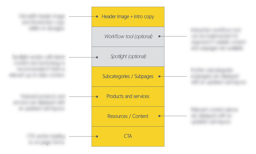
The client requested new page templates that everyone should follow, however, it wasn’t possible to create a one-size-fits-all solution. I proposed a modular template instead, providing consistency across the website, as well as flexibility for stakeholders to build their pages.
Despite the variety of existing page layouts, I noticed that most pages feature the same functions (in a different order or with a different look and feel) and I built my modular template around them:
- Hero image and intro copy / Spotlight section
- Subcategories that may or may not lead to subpages
- Featured products and services
- Related resources and content
- Main CTA leading to a separate form page
Improved card layouts
The current website predominantly uses cards to display information. However, all card types have the exact same layout (image, title, description) and very little indication of the type of content they lead to. Based on customer feedback, I decided to keep these cards but significantly improve their efficiency.
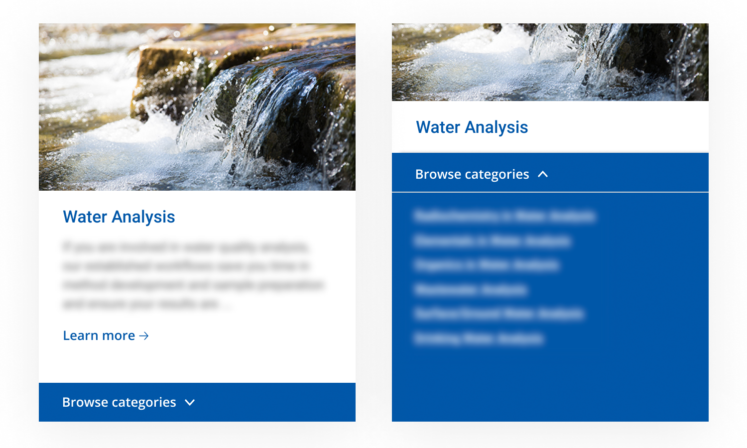
Module #1 - Subcategory cards
On the current website, if you hover over a subpage card’s title you can see a dropdown list of further categories within that page. Almost 70% percent of customers have missed this feature during the usability testing sessions. To help them find their niche field of science quicker, I designed a prominent “Browse categories” function.
I also added a call to action to the card template, as many cards on the current website are missing this small feature.
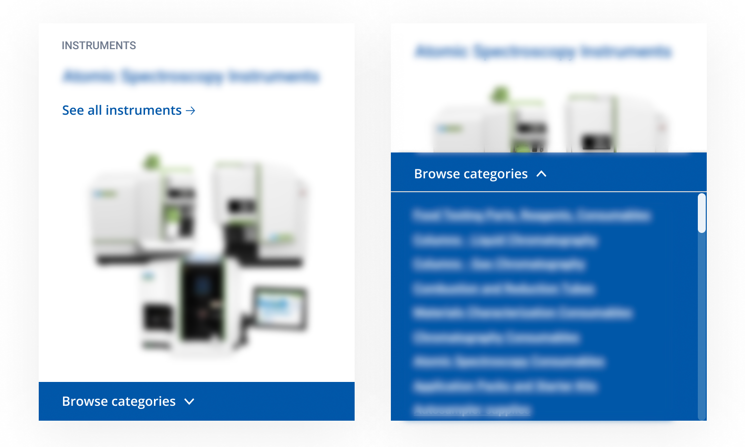
Module #2 - Product cards
To visually differentiate the cards that are leading to technical product pages, I moved the image to the bottom of the card. This also helps resolve the issue that almost all product images have a white background and the current cards seem to have different heights based on the product’s shape and height.
Each card has a small category title (instruments, services, etc.) to help users scan the content faster. On desktop, the “Browse categories” function also supports scrolling within the card for longer lists, on mobile, the categories and scrolling will be below the card.
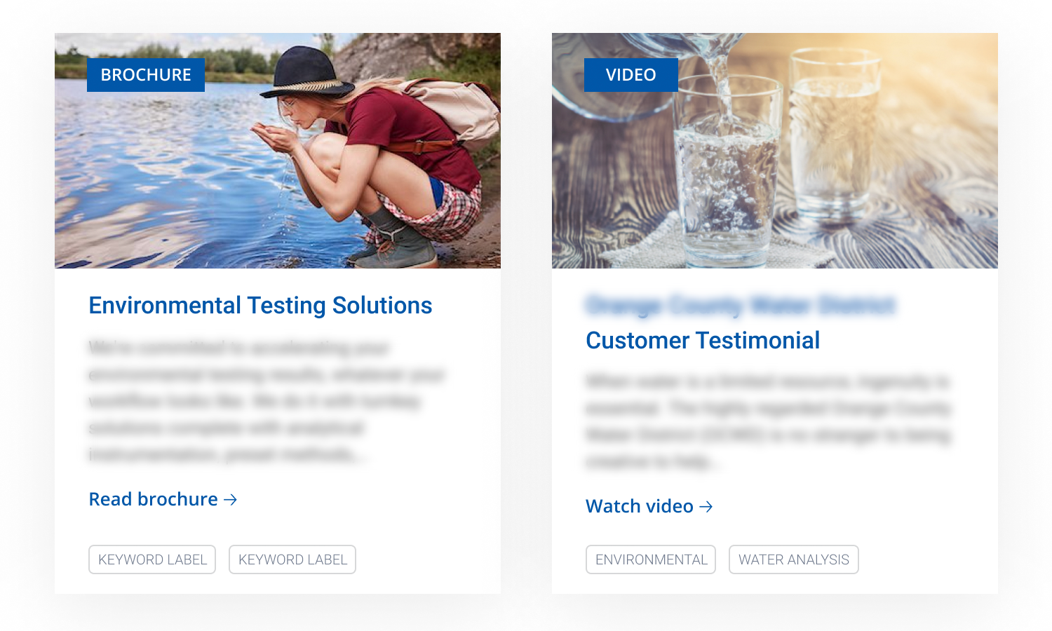
Module #3 - Content cards
The current website offers a lot of different formats of content from videos to articles and brochures. At the moment, users can only find out the type of content when they click on the card and visit the page. To ease the frustration customers expressed during the usability tests, I added a small label with the content format and recommended using clear CTAs as well to avoid surprises.
The clickable keyword tags at the bottom would allow users to find all pieces of content related to that specific topic which they were unable to do on the current website.
Additionial layout improvements
As part of the modular template, I shared my recommendations for an interactive tool that showcases the customer’s workflow, as well as for an improved spotlight section and contact form.
Module #4 - Workflow tool
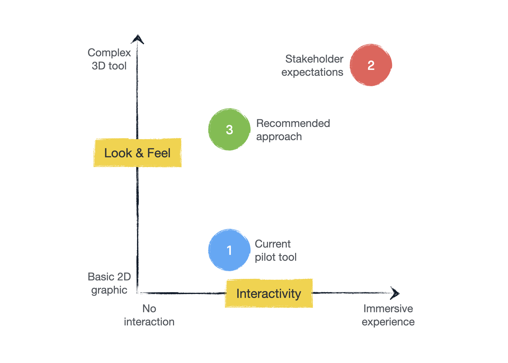
My client already had a pilot visual tool that allows customers to visit pages related to each step of their workflow. This pilot tool featured basic interactivity and a slightly outdated look and feel. Their internal stakeholders were pushing for a modern, highly engaging 3D tool for each segment and I created this graph to help us visualise the options.
Based on the current website’s technical capabilities, I advised them against developing an immersive 3D experience as it’s highly unlikely that the website could handle it on all devices. My recommended approach was a compromise where we boost engagement through eye-catching design, not the level of interactivity.
Module #5 - Spotlight section
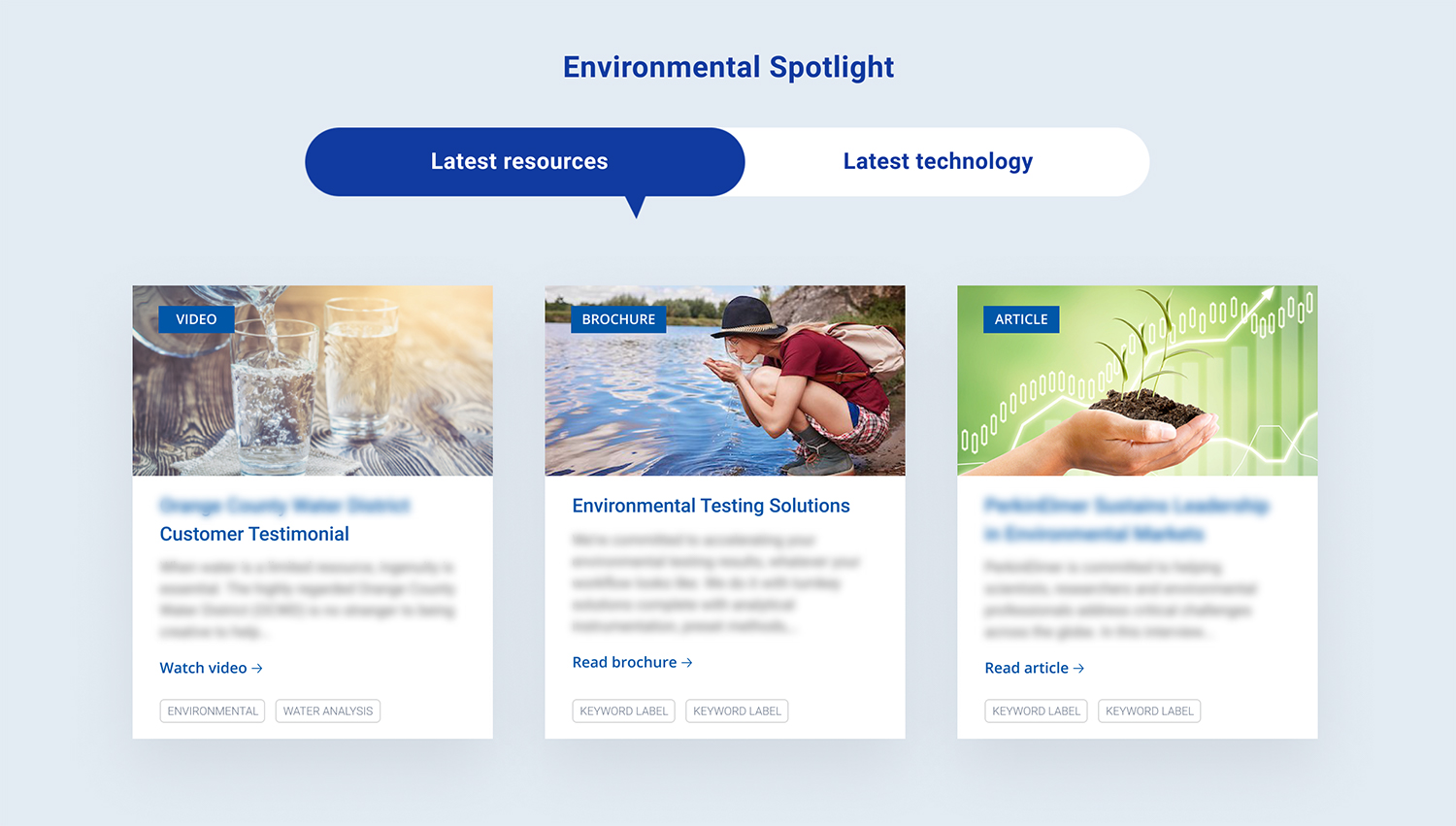
According to the customer interviews, existing customers would mainly visit the website to see if my client has released any new technology or white papers. To support their primary user goal, I repurposed the currently used spotlight section on the website.
Instead of randomly featured items across all pages (without indicating why they are in the spotlight), my recommendation was to create two consistent labels: “Latest resources” and “Latest technology”. This way users can find the latest releases without browsing through multiple pages and sections.
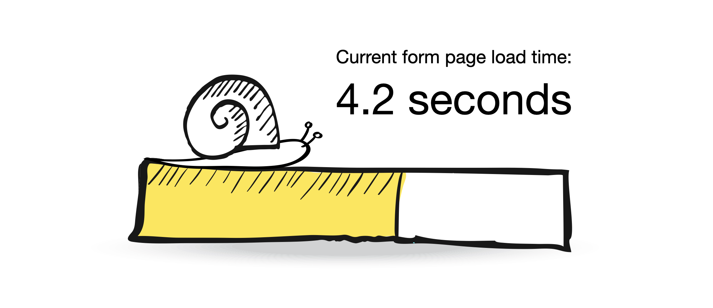
Module #6 - Modal forms
The majority of my client’s instruments cannot be purchased directly from the website due to their complexity and price range. Users need to get in touch to find out more but the current average load time for the form page is 4.2 seconds, which is painfully slow. To avoid frustration and losing potential customers, I recommended implementing an easy-to-access modal form on all pages, instead of redirecting users to a separate contact page.
Conclusions & Next steps
Working on this project has definitely thought me how to listen and collaborate effectively when you work across a global corporation and have a huge number of people involved in your project. It was also an interesting challenge to create something better using only the existing elements of highly restricted corporate guidelines.
If there was more time, I would try to dive deeper into the science behind each segment myself. This could help me conduct more customer interviews and gain more in-depth knowledge about their everyday behaviours and pain points. In addition, I would also organise more regular check-ins with the key decision makers on the client’s side to avoid significant delays in the project.
As for the next steps, I am currently finalising the high-fidelity prototype of the new page layouts and hoping to conduct further usability tests with existing customers in the near future, depending on their availability. In the meantime, we are scheduling further stakeholder workshops to be able to design the right customer workflow steps for each segment and target market.