PanIQ Room

Improving user experience for a global escape room franchise

Real-life mysteries and immersive high-tech experiences—PanIQ is a highly successful Hungarian escape room brand with the most franchise locations in the United States. Building on their momentum, the company has been expanding all over the world from Sweden to the Bahamas.

However, as their success was growing, they started receiving more and more complaints about the booking experience on the website. They asked me to investigate the root of their problems and provide solutions for the issues customers were facing on the website.

  • Project by
  • DekoRatio
  • My role
  • UX Researcher / UX Designer
  • Duration
  • 12 weeks
  • Key tools
  • Google Analytics, Photoshop, InVision
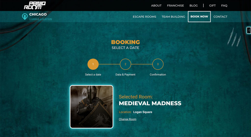
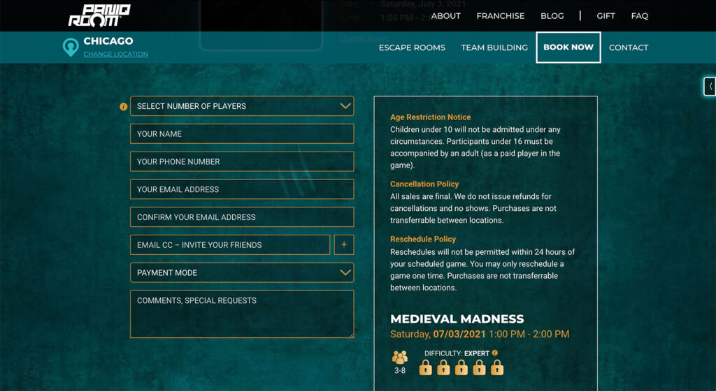
UX analysis
What issues can get in the way of
booking your escape room?

To understand the barriers users might face, I kicked off the project with an in-depth analysis of the existing website. I analysed the available user data in Google Analytics, as well as evaluated the site against key user experience principles and heuristics.

Issue #1
Lack of mobile optimisation

Whilst the majority of users were visiting from mobile, the website was clearly not optimised for a mobile experience. This was definitely a good starting point in uncovering why people are having difficulties booking an escape room.

Some of the major mobile usability issues:

  • Multimedia content wasn’t optimised for mobile, leading to alarmingly slow page load times
  • Screen layouts were falling apart (e.g. only 2 days visible from a 7-day calendar view)
  • Tappable area was too small for most key functions and buttons
Issue #2
Navigational issues

The homepage featured a map tool that allows you to select your location. This feature wasn’t suitable to accommodate the upcoming new franchise locations around the world and it took up an unnecessarily large space on the screen. Apart from the map, there wasn’t any other option to navigate from the homepage. The main navigation bar and menu items were only visible on subpages.

Issue #3
Lengthy pages, buried key content

Once you selected your city, the site redirected you to a location-specific landing page. However, users were forced to scroll through a large amount of irrelevant content before they could see what they came for: the available escape rooms and prices for this location.

Moreover, if you selected the wrong location accidentally, there wasn’t any clear way to see which city you are looking at and how to change it, apart from a hard-to-spot text above the main navigation bar.

The list of potential usability issues was far longer. But with a good amount of initial areas to test, it was time to see how users would go through the process during usability tests.

Interviews & Usability tests

To understand potential customers’ context and user goals, I conducted in-depth user interviews with 6 participants who have booked an escape room in the last 6 months, followed by usability testing sessions on the existing desktop and mobile website (3 desktop / 3 mobile).

Key findings from these sessions:

  • Users tend to visit the website multiple times for initial research on available rooms, then booking a selected room for the group
  • Users pointed out that the booking process on mobile is “painful” and the mobile website “seems like an unfinished site with many issues”
  • The feedback on the map navigation tool was mixed, some people really enjoyed using it, some people would prefer a dropdown list
  • Users were genuinely confused about the lack of navigation on the homepage and inconsistent menu items on subpages
  • The payment layout feels unsafe and made people cautious about inputting their card details
  • The information for franchise partners is too prominent on all pages
Proto-personas
Who visits the website?

Building on the user interview findings and sales data provided by the company, I was able to create three differentiated user personas:

  • Leisure customer
  • Business customer
  • Potential franchise partner

I am not at liberty to share the detailed proto-personas and their user journey maps. However, synthesising the findings from my research has helped me define the key problem statements for the project.

Problem statements
How might we...

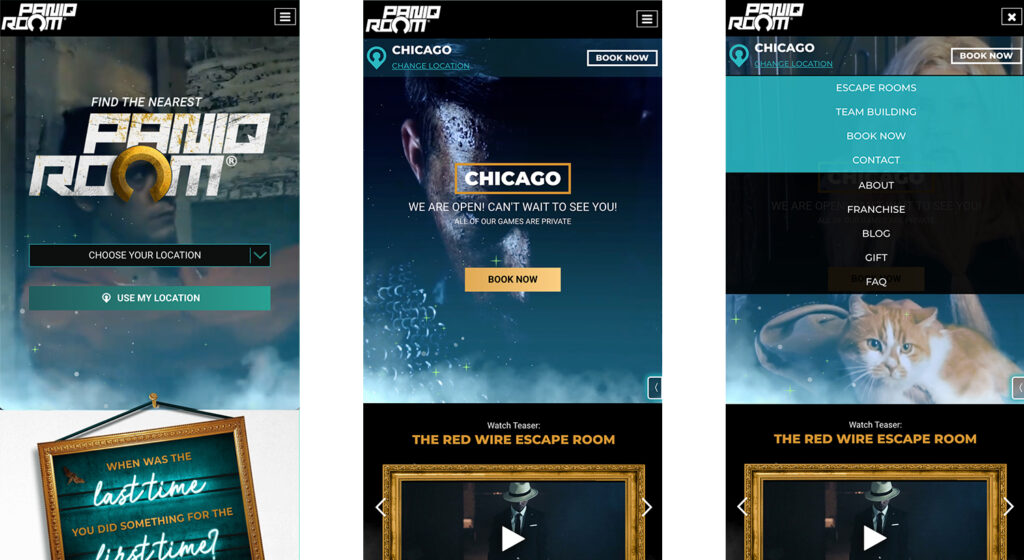
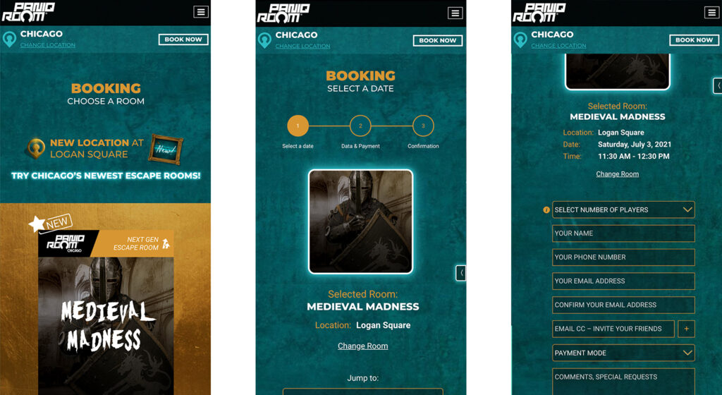
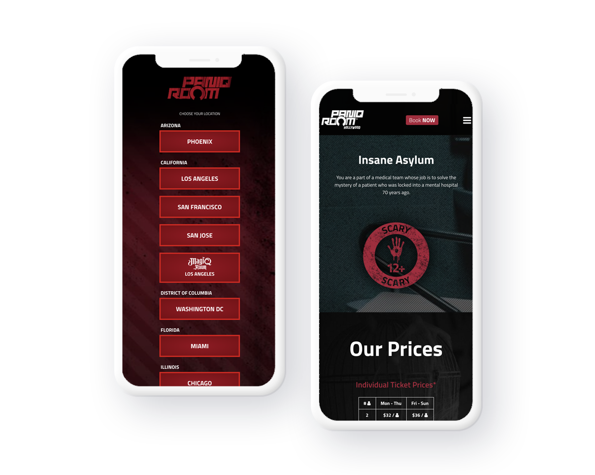
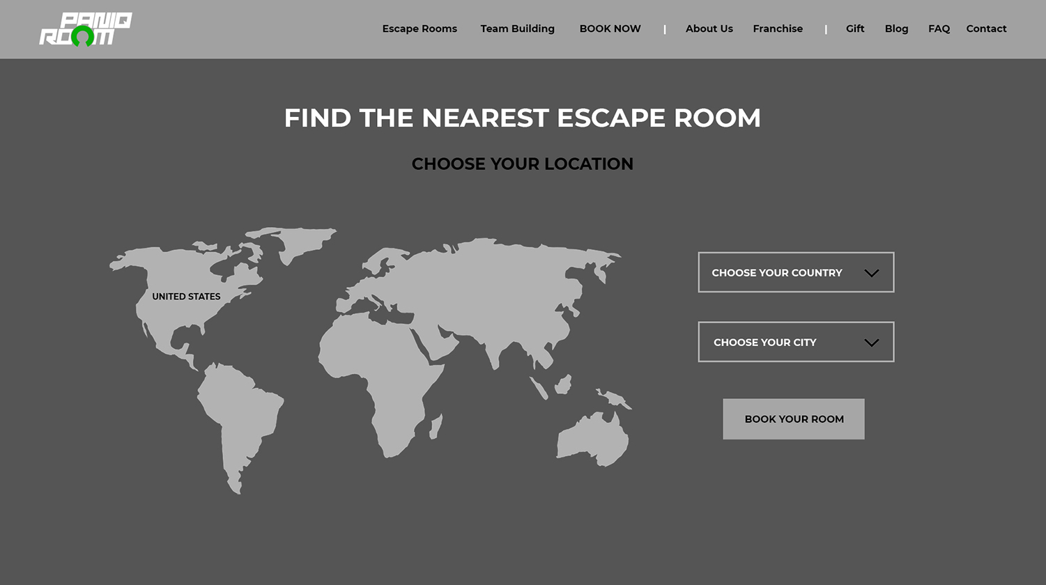
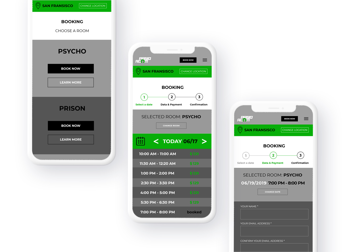
Provide a more frictionless mobile booking experience?
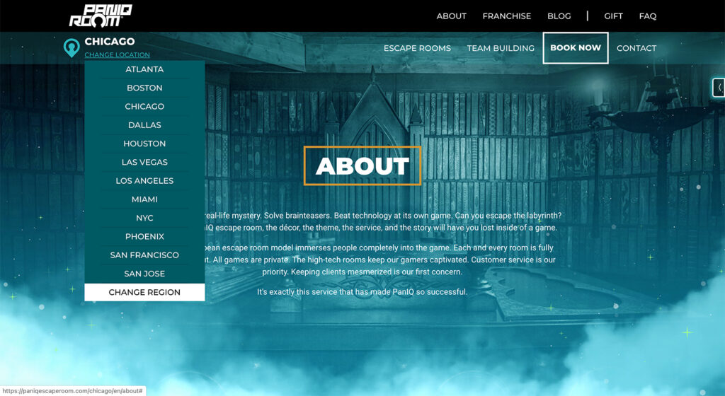
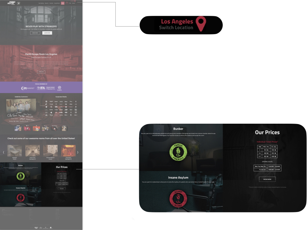
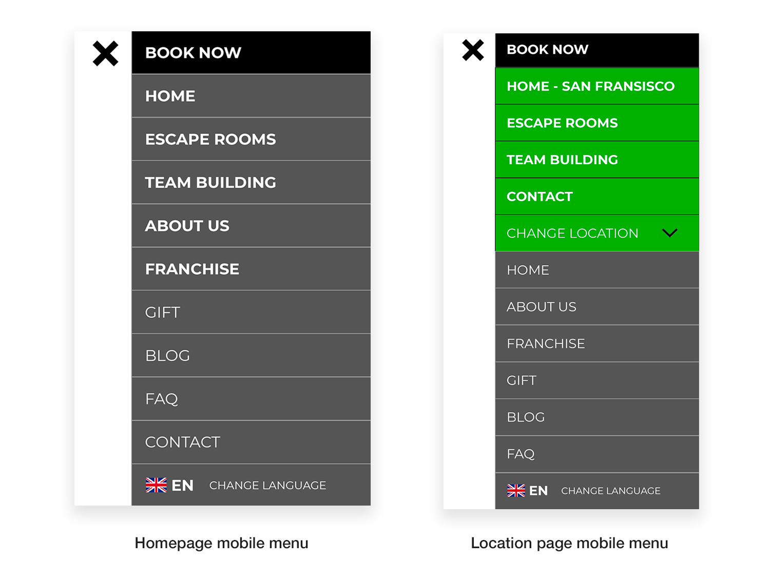
Create consistent navigation across all subpages and locations?
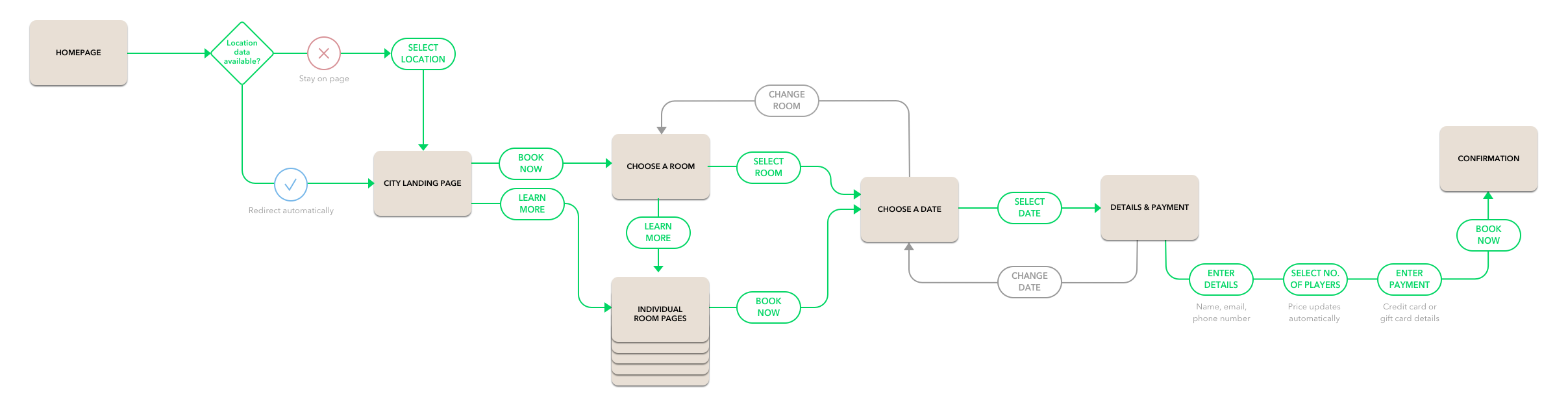
Create opportunities for users to correct their mistakes/change their selections?
Establish a more secure feel when users need to enter their card details?
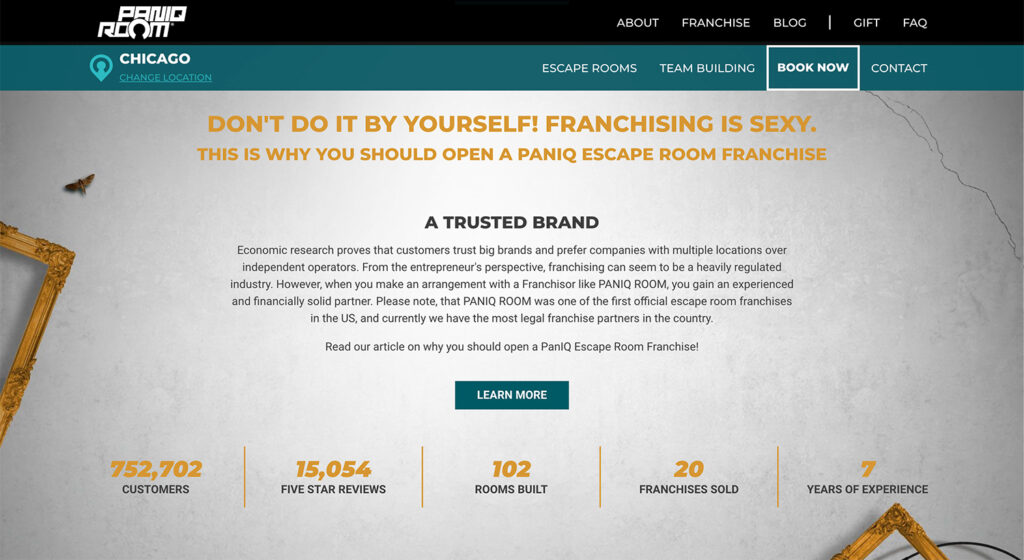
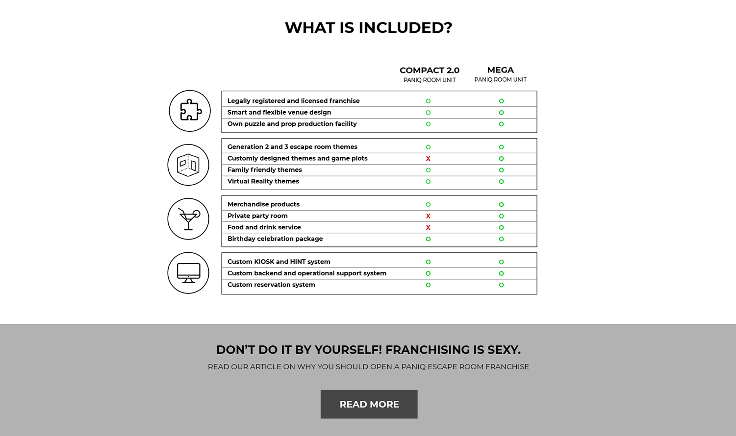
Inform franchise partners without overwhelming customers?

User flow
Designing the primary user flow:
A combination of clear CTAs and
options to change your mind

Based on my research, the primary user flow is a single leisure booking for a group of family and friends. I designed a flow that accommodates both the research and booking phase for these customers. I also designed secondary flows for business customers where booking multiple rooms at once is the main user goal, and for franchise partners who are looking to learn more and get in touch.

Sketching
Sketching my ideas with the primary
and secondary flows in mind

Before I started designing my solutions for the prototype, I created many iterations of initial sketches using pen and paper. This helped me visualise how the potential solutions can work on screen for both desktop and mobile. Not all my ideas made the cut but once I was happy with the final iterations, I started building my mid-fidelity prototype using Photoshop and InVision.

Medium-fidelity prototype
Bringing the ideas to life
Selecting your location

Based on the mixed opinions of users, my initial idea was to provide both the map tool and dropdown location selector on desktop. In theory, these would be linked together, for example, if you select your country in the dropdown, the map tool would zoom into that country as well. After consulting with the dev team, we have decided not to include an interactive map tool due to the costs and time required to build it. Our final plan was to use only the dropdown function both for desktop and mobile. I also strongly recommended providing smart defaults based on user location data.

Introducing secondary navigation

On the location pages, users had difficulty understanding which navigation items are constant across the website and which lead to content specific to that location. To resolve this issue, I designed a secondary navigation that highlights the location-specific pages.

On mobile, these pages are highlighted with a prominent colour and are always placed on top of the list of navigation items. On desktop, I introduced a secondary navigation bar that clearly shows your selected location and all the relevant pages for that location.

Restructured location page

As mentioned above, individual location pages in the desktop prototype feature a secondary navigation bar where users can access the escape rooms, team building content, booking and contact information that is specific to their chosen location. I was way too eager to highlight the location itself and placed it in the middle of the bar which looks a bit clunky if I’m being honest. Therefore, this was later moved to the left-hand side below the company logo.

The other key change for the location pages was moving the available escape rooms to the very top, just below the header section. Users made it very clear during the interviews that their primary goal is either to research or book rooms, therefore, this content should be easily accessible on all the location pages. Unfortunately, I was facing too much pushback from decision makers who prioritised promotion over usability and this idea did not survive until the development phase.

Booking your room

When designing the new booking process, I primarily focused on the mobile experience and then translated this process to desktop. I introduced a progress bar to manage user expectations about the booking process. Selecting your room wasn’t included as a step in the process to reduce the number of steps a user has to “visibly” take.

The new date selection step on mobile only features one day at a time and I also made sure to include options to change your previous selections throughout. Initially, I created a placeholder for a payment section that looks and feels safe. However, after reviewing the online payment options, we decided to go with a separate payment page operated by my client’s bank. During the “Data & Payment” step on the final website, you can only select your preferred payment method.

Comparing franchise packages

On the initial franchise page, there were two very long unstructured bullet-point lists of franchise benefits for each available package. I noticed that the two packages are nearly identical and recommended creating a comparison table instead.

In the table, I created four separate groups of features with similarities, accompanied by a relevant icon. This way users can scan and digest the information easier and it can help them understand the differences between packages quicker.

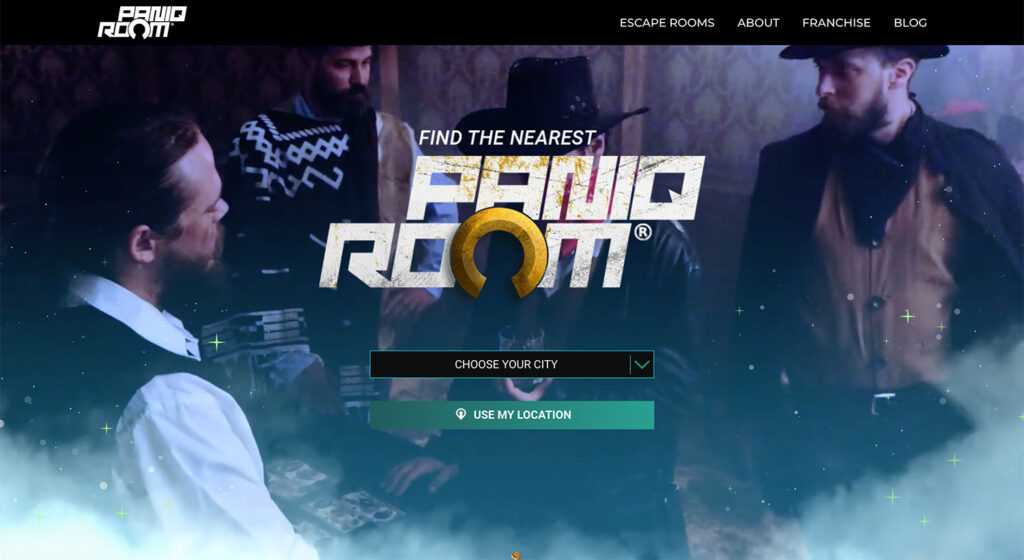
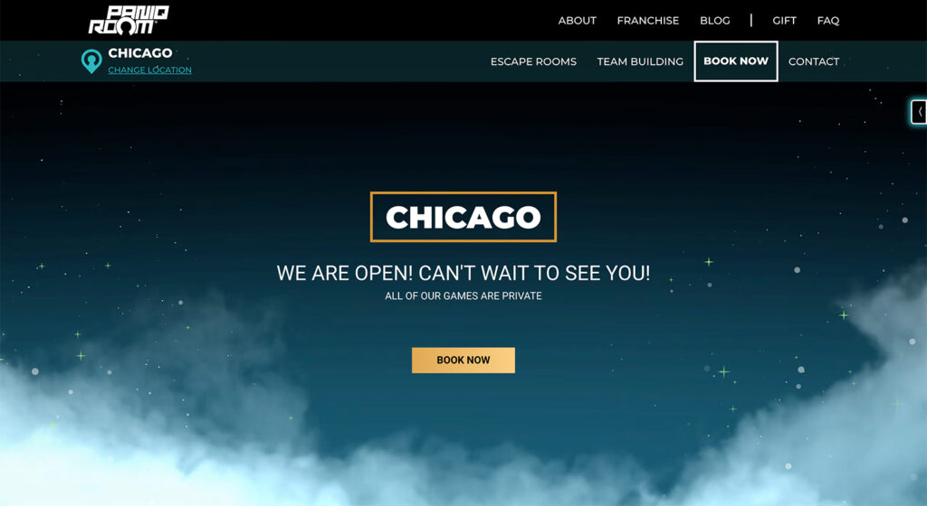
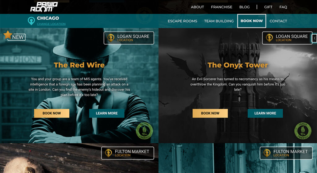
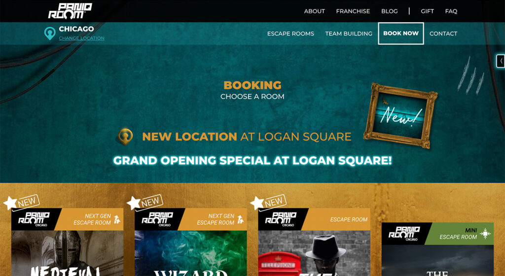
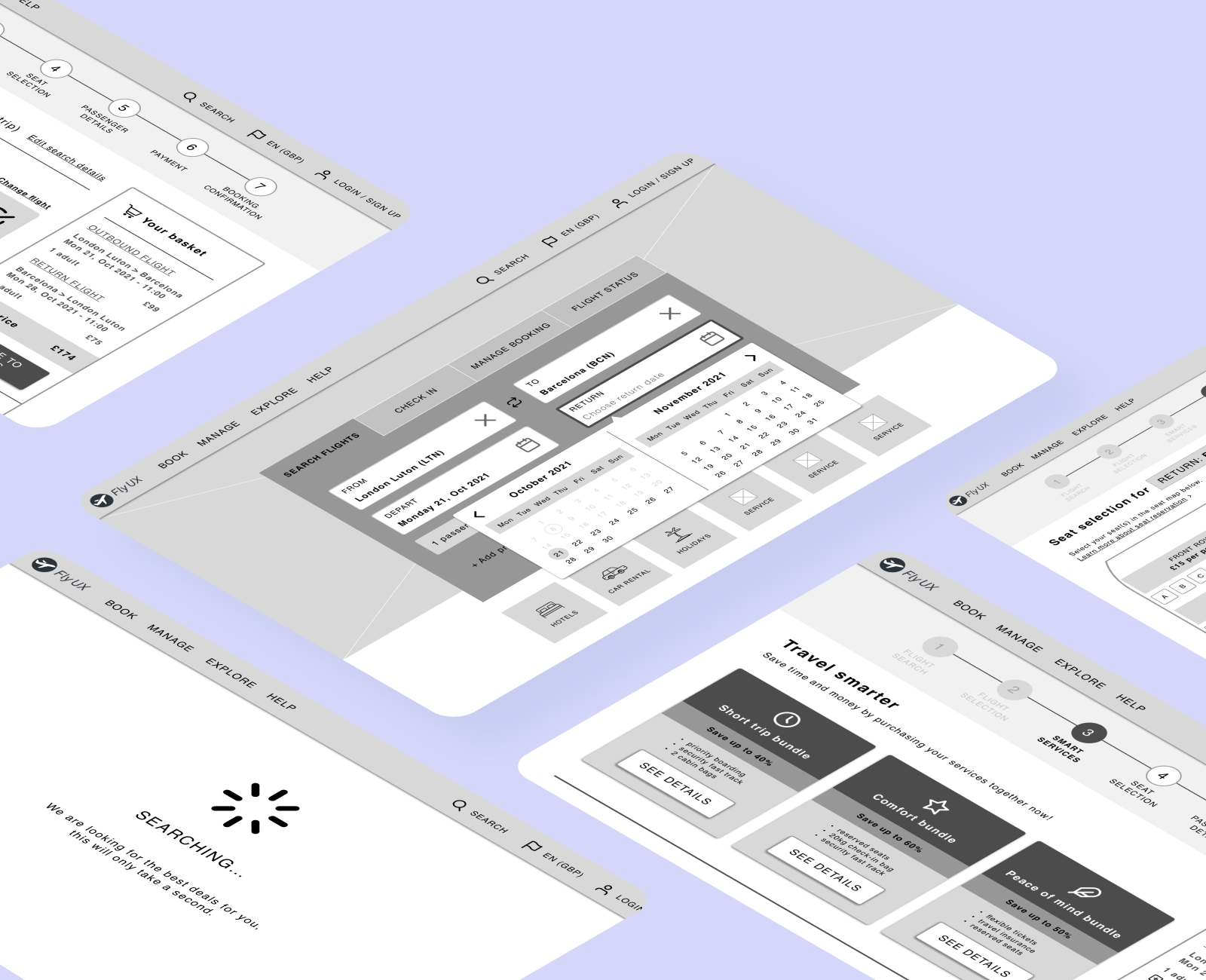
Click the images below to see the latest
desktop or mobile prototype in action
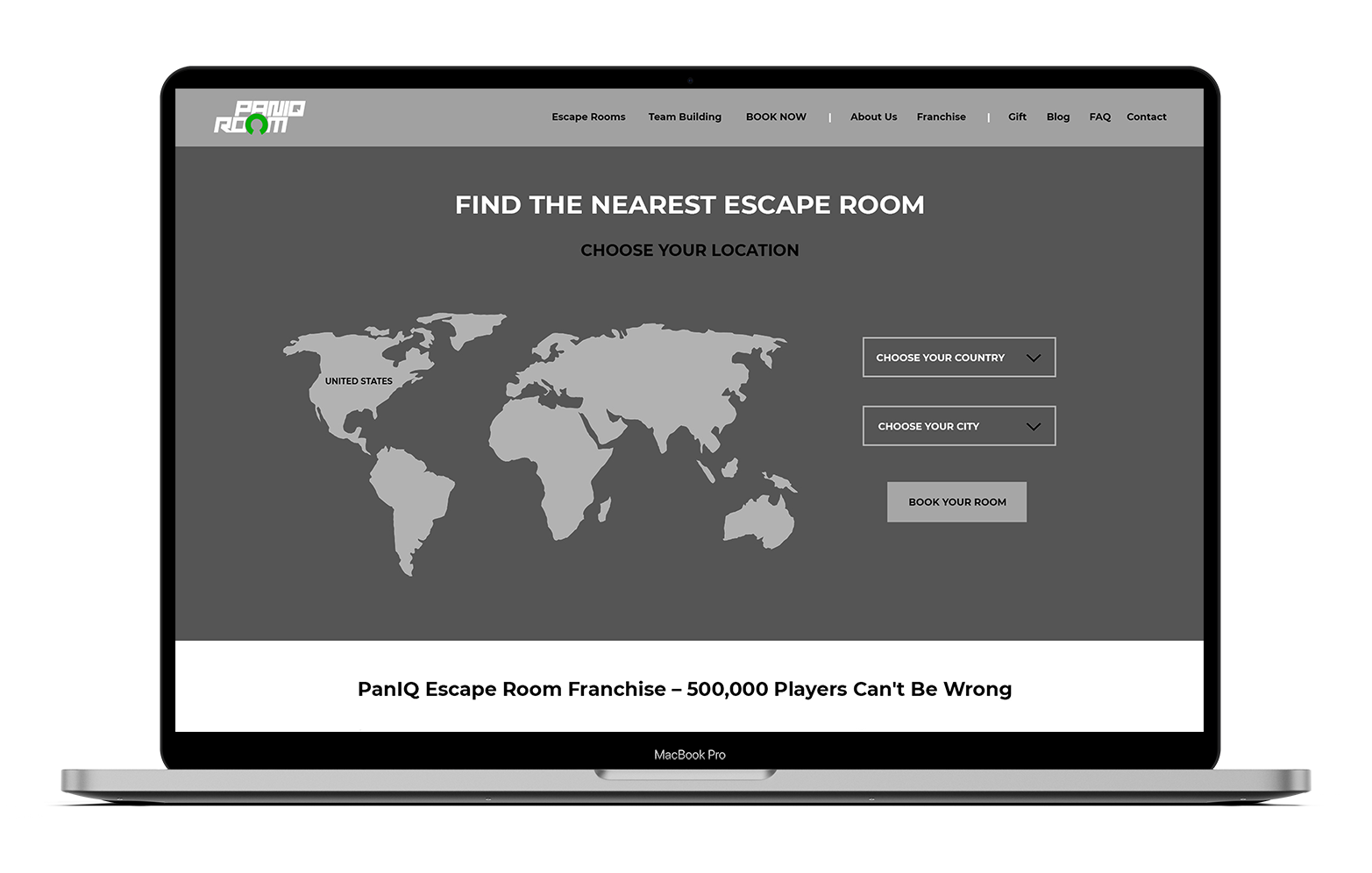
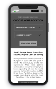
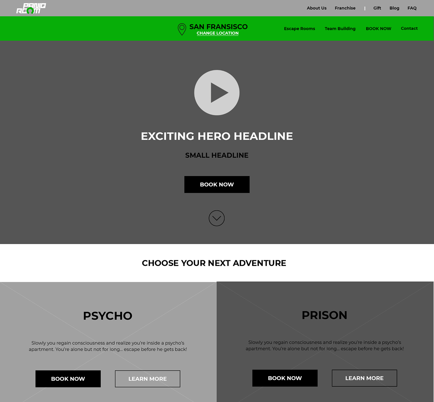
Final product
The final UI below was designed by
a separate team based on my initial
mid-fidelity prototype and wireframes
SUMMARY
Conclusions & Key takeways

As this project took place in the very early stages of my journey to become a UX Designer, I consider myself extremely lucky for the opportunity to lead this project. I was able to experience the power of UX research, learn how to use prototyping tools and design solutions for real-life software. Of course, with the knowledge I have today, I would do and design many things differently.

If I was working on this project today, I would pay more attention to the small details, for example, how the booking form is structured and labeled. Apart from the elements I would change in my own designs, I would also make sure to represent users’ interests throughout the process. I would try to persuade and convince decision makers to rely on the research data rather than their own individual ideas. And finally, I would get more involved in the UI design process, to make sure my features and functions are not getting lost in the sea of unnecessary design elements.