Fly UX

Optimising the flight booking process of low-cost airlines

Low-cost airlines tend to follow one major industry convention on their websites: selling as many extra services as they possibly can. Whilst this can be justified from a business and marketing point of view, they’re missing the most important point: what impact does this have on the user? The aim of my project was to uncover how users really feel about the existing flight booking process across the industry and design a solution that has the potential to solve their problems.

  • Project by
  • UXDI bootcamp
  • My role
  • UX Researcher / UX Designer
  • Duration
  • 10 weeks
  • Key tools
  • Sketch, InVision, Mural, Zoom
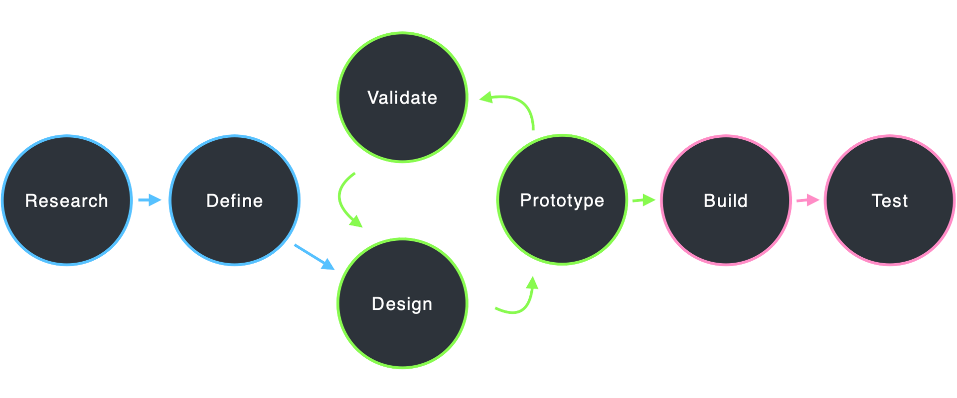
My design process
Desk research
For a task as simple as buying a ticket, how can the booking experience be so different across the industry?

As a starting point, I reviewed travel-related websites to see what they’re doing well that I can emulate when it comes to designing my own flight booking process. Most of the websites were airlines, but I was also interested to see if I can learn anything from other types of travel products such as public transport or hotel websites.

During my desk research, I came to realise that for a relatively simple task as finding and buying a plane ticket, many different solutions exist across airline websites. This made me wonder how users are interacting with the different booking experiences and I kicked off my user research to understand their needs and pain points better.

Online survey
Why do people visit airline websites?

To learn more about the goals of people that use airline websites and apps, I created an online survey. Ideally, I would have placed this survey on an airline website to intercept people as they’re using the software. In this case, I sent the survey to friends and colleagues instead (who have used an airline website within the past 4 weeks).

Key findings:

  • Primary user goal is to research prices for available flights, followed by booking a flight
  • Price is the most important factor when selecting flights
  • Users are frustrated by the level of advertisement
Interviews & Usability tests
Confusion, distrust and mistakes -
the common themes of booking a flight

To dive deeper into understanding airline customers’ mental models and behaviours, I conducted in-depth user interviews, followed by comparative usability testing sessions. During the sessions, users completed the same flight booking tasks on two different airline websites.

It was surprising to see that none of the participants had a straightforward booking experience. Even people who are frequent travellers struggled with some of the steps along the way. Although their pain points and frustrations were different, they were all related to selecting the right flight and fare type.

Affinity diagram
Understanding the problem
through collaborative analysis

Having a good amount of data from my user research allowed me to collaborate with a fellow UX designer to get to the root of my findings. During the affinity diagram session, we worked together to put structure on the large volume of qualitative data from my research.

On this board, we’ve gathered the goals and mental models of users, as well as their behaviours, pain points and positive feedback during usability testing. In order to understand the directions I would need to take with my design, we arranged the data in categories that reflect each step a user would usually take during a booking process:

  • Homepage / Using a flight search tool
  • Selecting flights on the search results page
  • Selecting fare type
  • Selecting seats / additional services
  • Passenger details
  • Payment
  • Confirmation
Customer journey mapping
An exciting start, followed by
too many hoops to jump through

Building on the affinity diagram findings, I created a user journey map to put even more structure on my research data. This allowed me to visualise the problem areas of the existing user journey:

  • Selecting a flight from search results can be too complicated
  • Selecting a fare type can be confusing
  • Additional services can be overwhelming

It became clear to me that users are expecting to see a clear answer to their search, but instead, they are presented with too much information and too many options to consider which causes confusion and frustration. During the flight selection process, their primary goal is to find the best price and time to travel, and asking them to consider fare types does not match their mindset at this point. They are not ready to consider luggage and service options just yet, but forcing them to do so makes them already frustrated by the time they get to the actual service selection step.

To synthesise my observations about users and guide my future designs, I created the following problem statements below.

Problem statements
How might we...

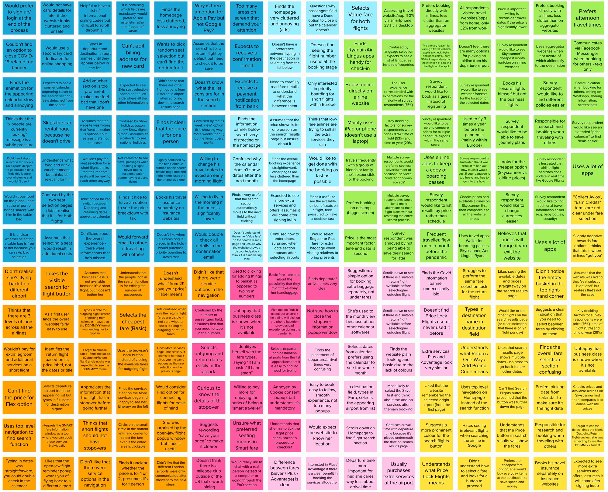
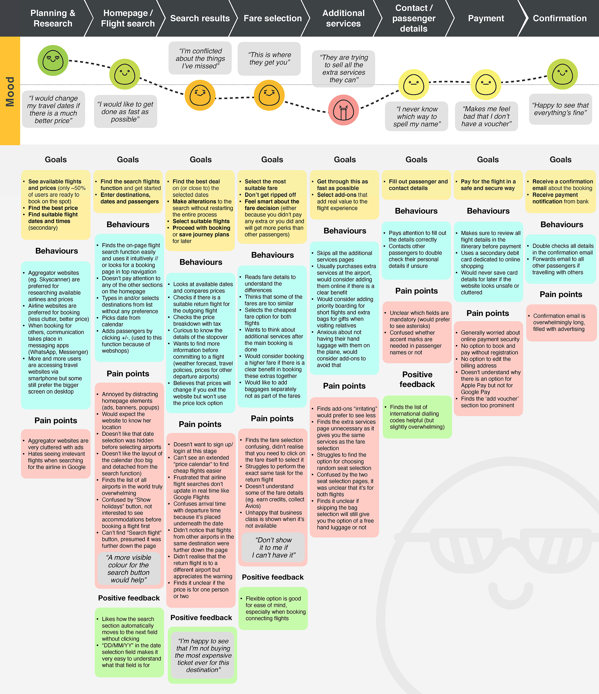
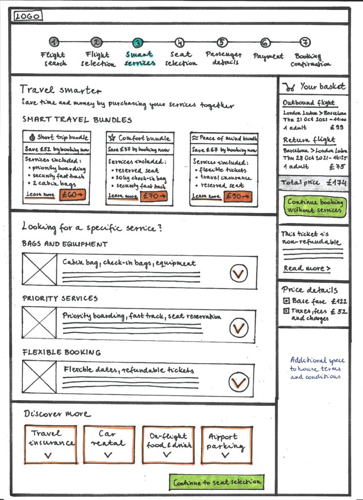
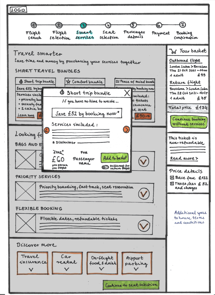
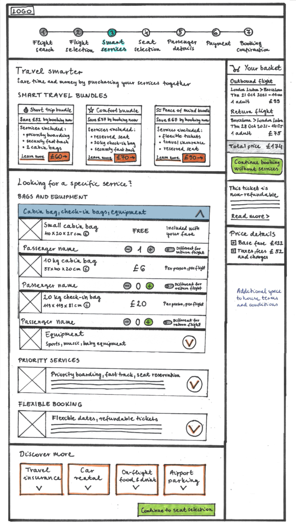
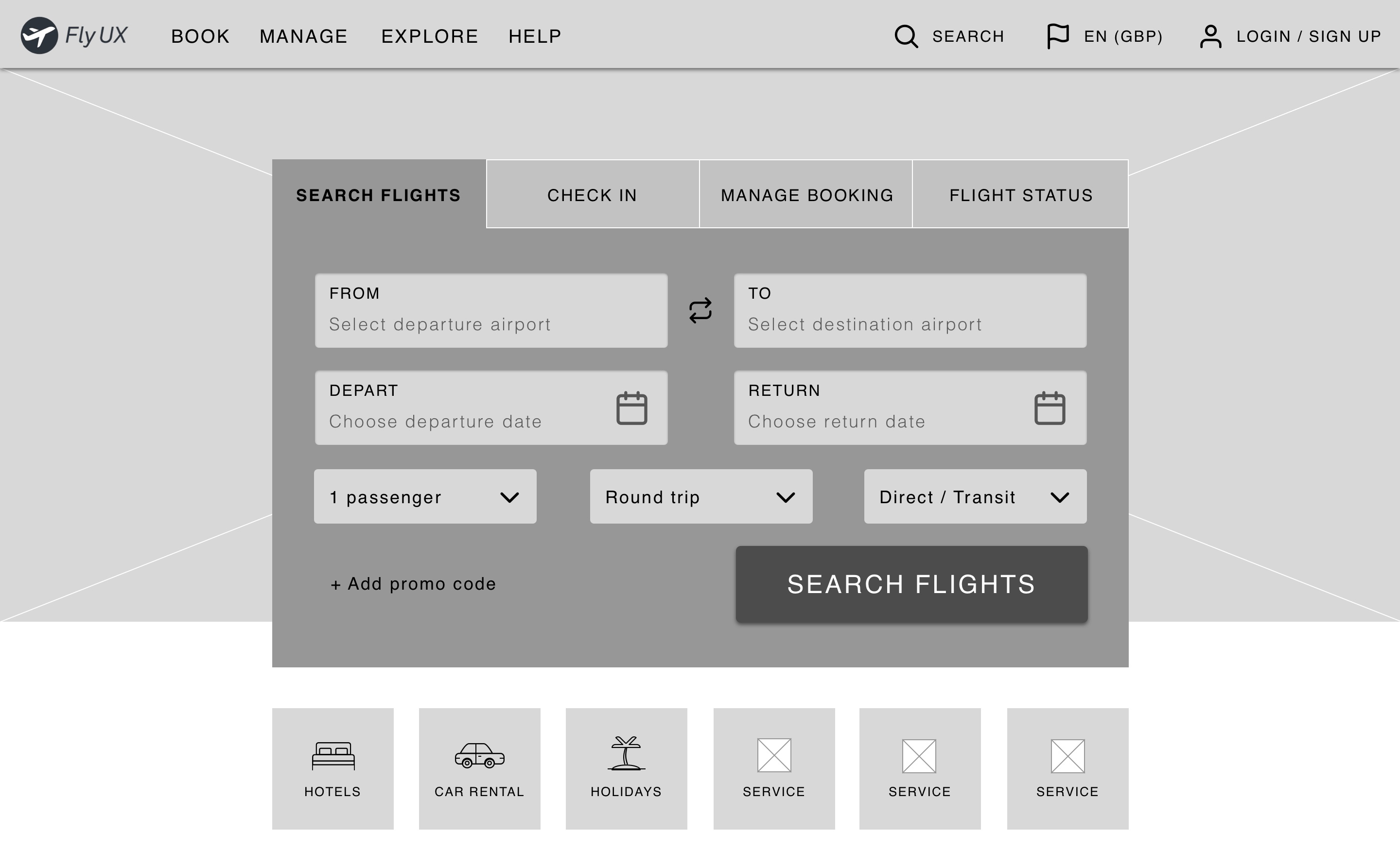
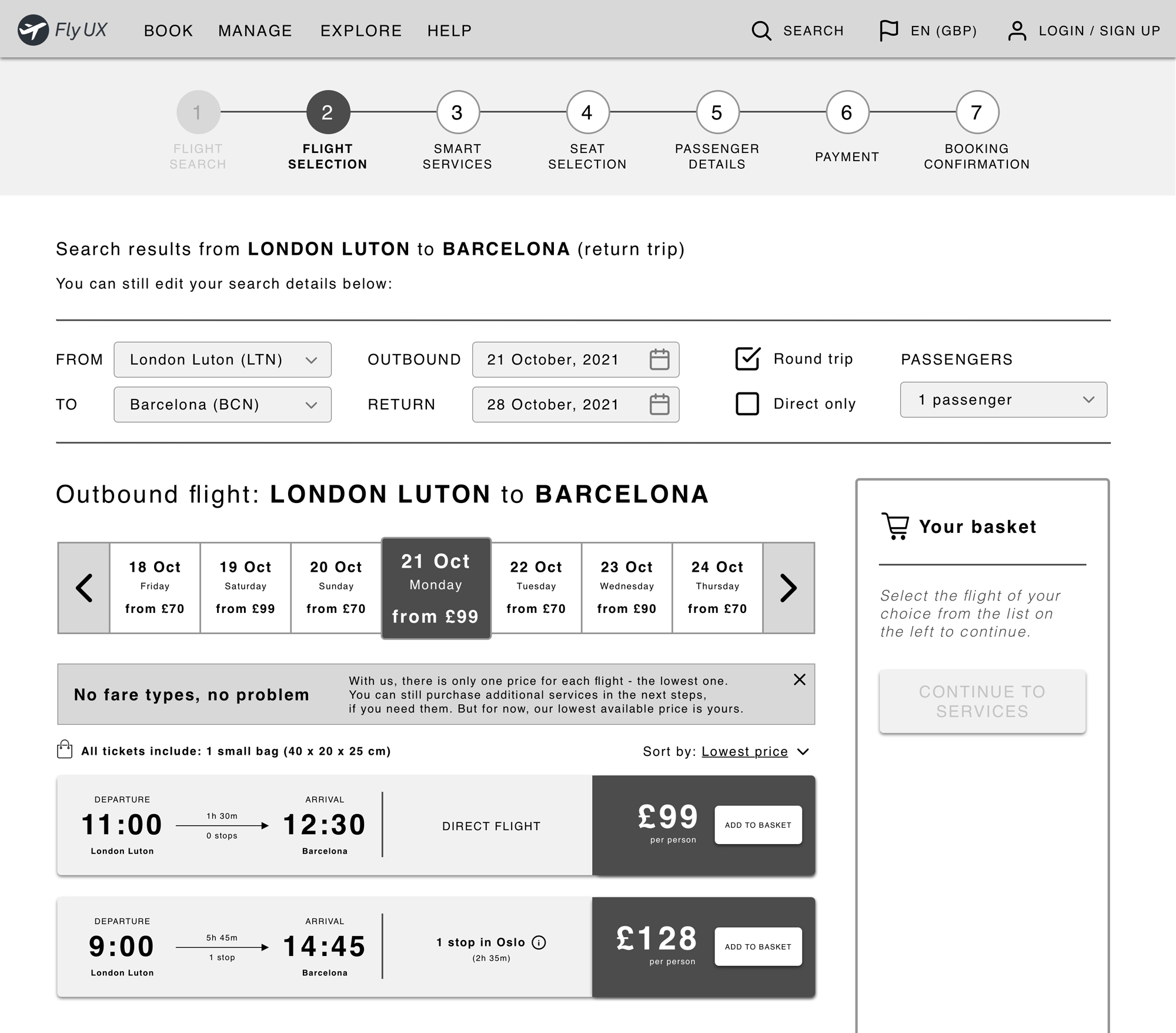
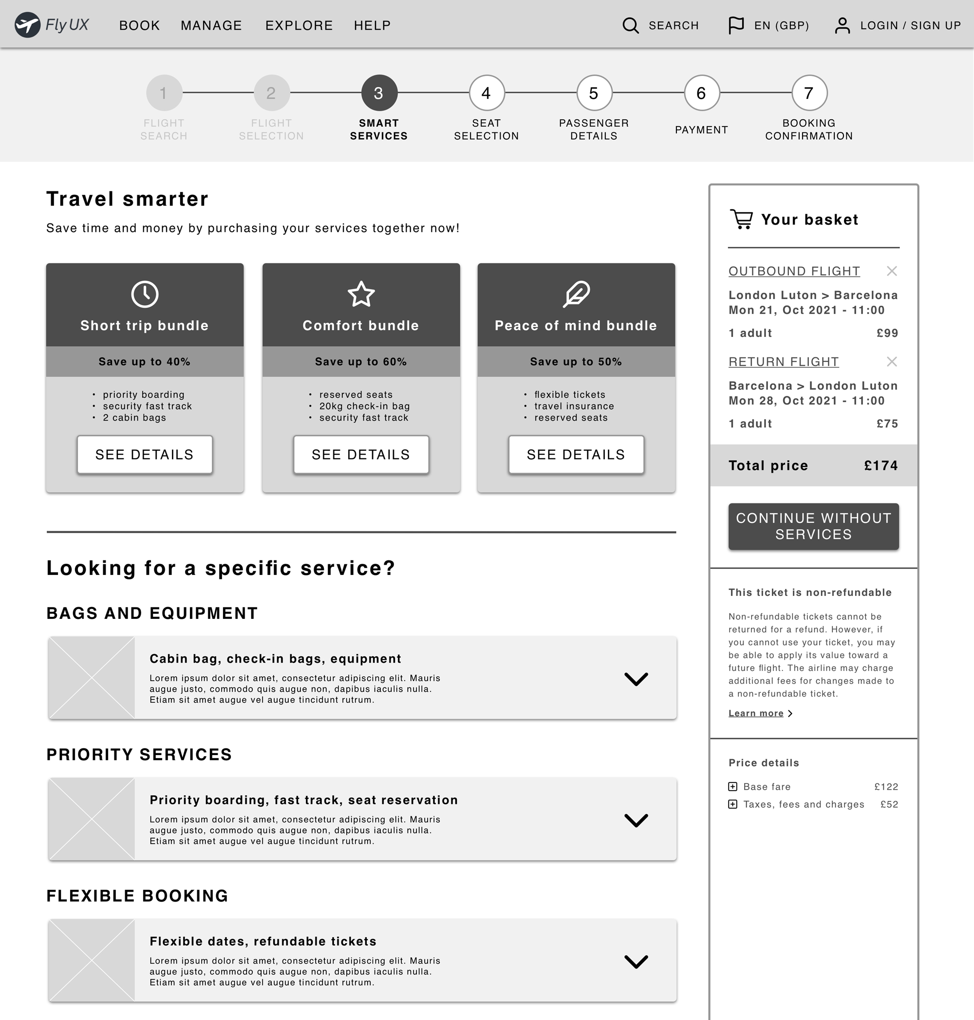
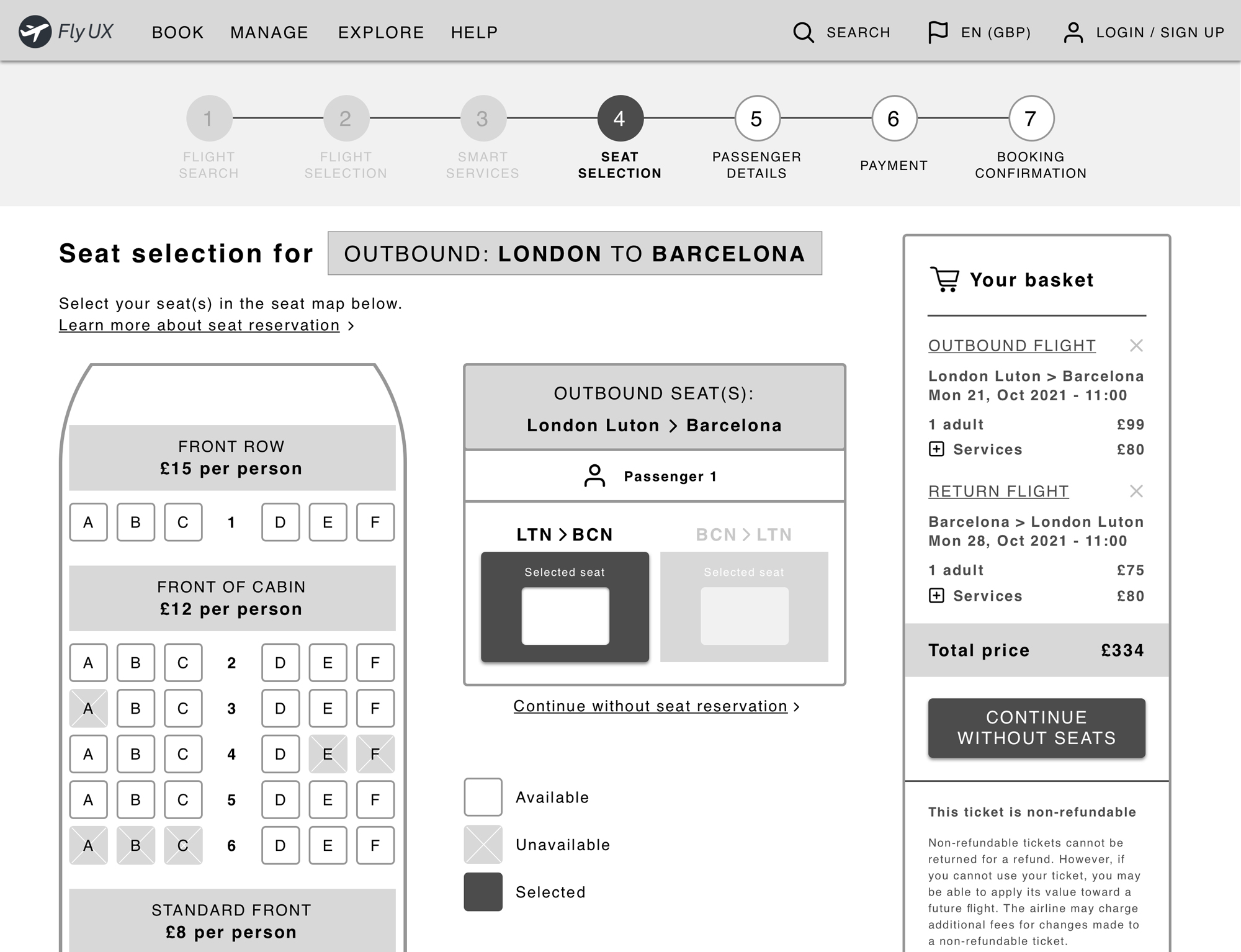
Reduce the amount of information to simplify the flight booking process for users?
Present fare types and services in a way that sparks action instead of mistrust and frustration?
Help users feel confident with their selection and avoid unpleasant surprises at checkout?

User flow
Can we ditch an industry convention?
How would a simplified journey look like without fare selection?

As I started to define the high-level user flow for my primary use case, it suddenly hit me: these airline fare types are nothing else but a couple of extra services, masquerading as a ticket type. It became loud and clear during my research that at this point in their journey, people are focusing on figuring out the best dates, times and prices for traveling – and prefer to think about the granular details (luggage, services) later. So what would happen if we allow them to do that?

An airline's gotta sell -
Introducing service bundles

Simply removing fare selection would result in a significant loss of revenue for the airline. That is why I decided to turn them into an attractive, cheaper bundle option and present them at the services stage – when people are more open to consider it. After reviewing other low-cost airlines’ fare types, I was able to create three test bundles that cover most of the services offered during fare selection.

Paper prototype
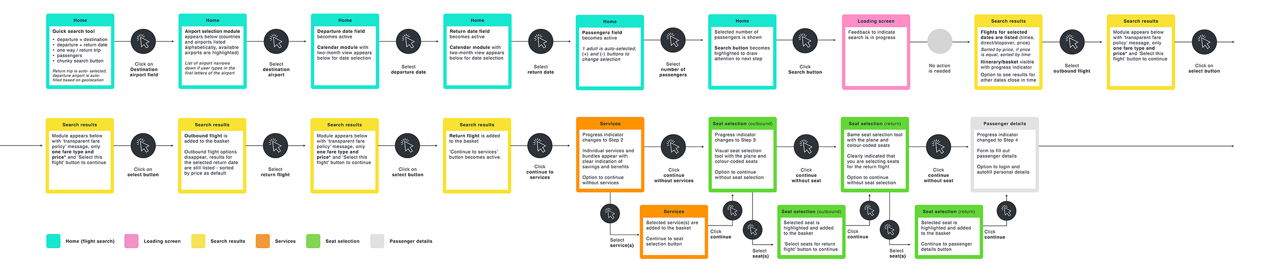
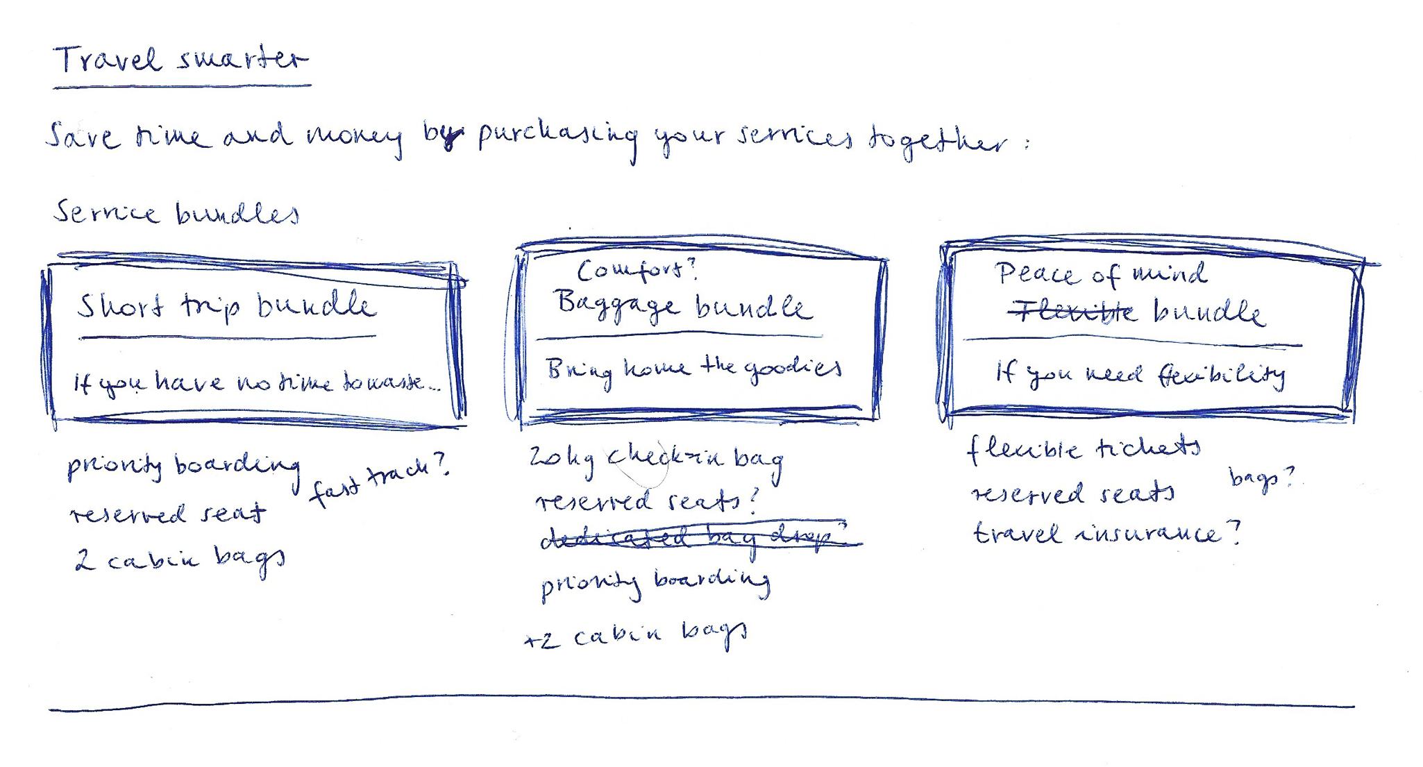
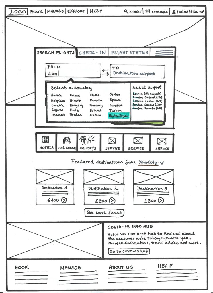
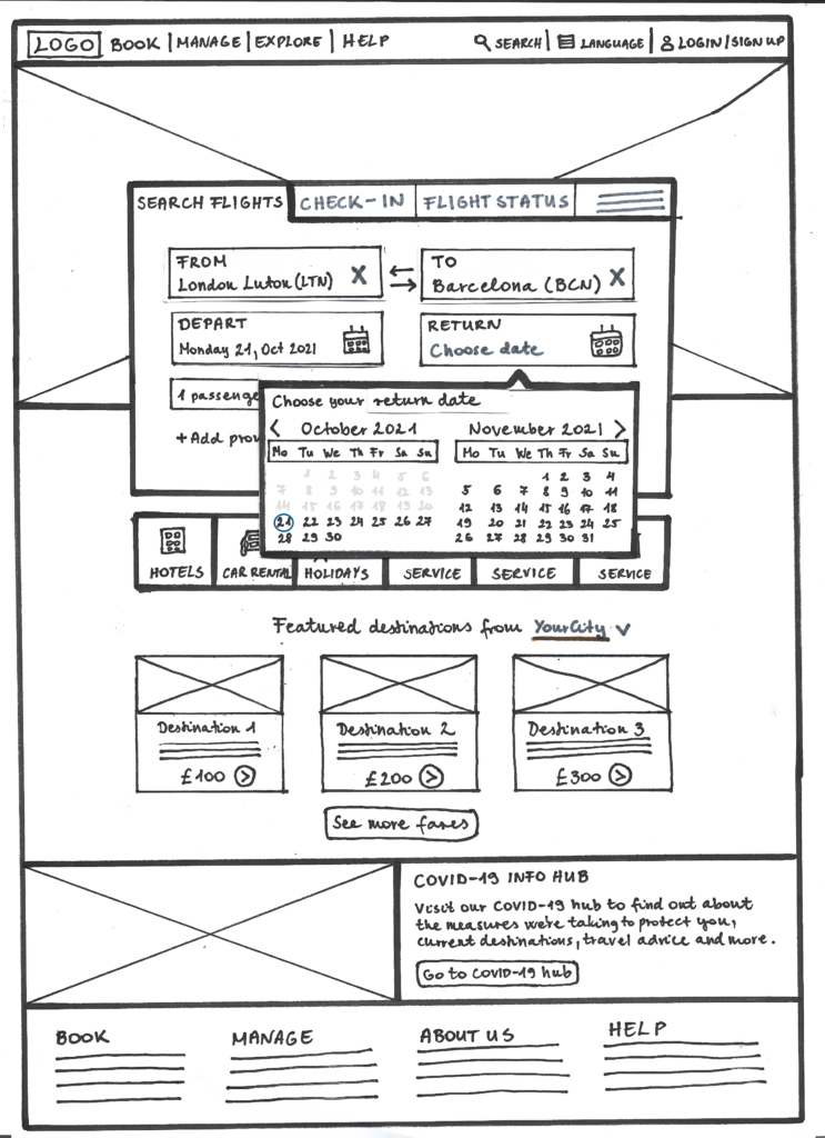
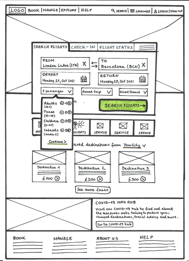
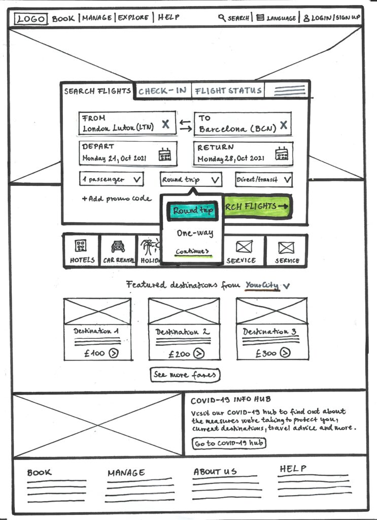
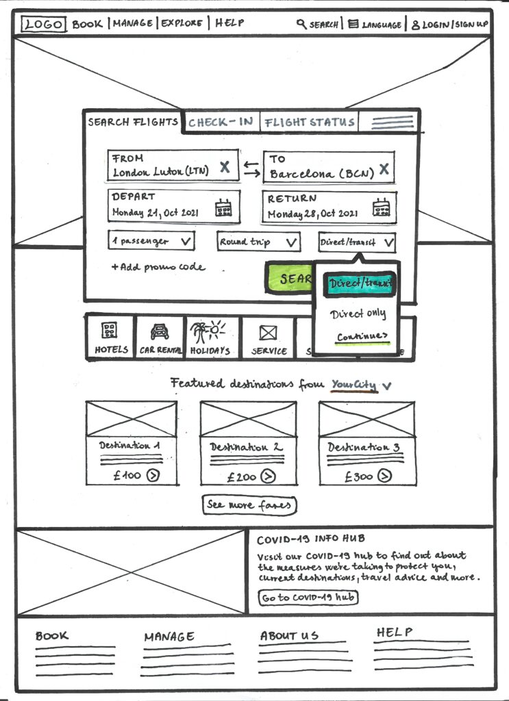
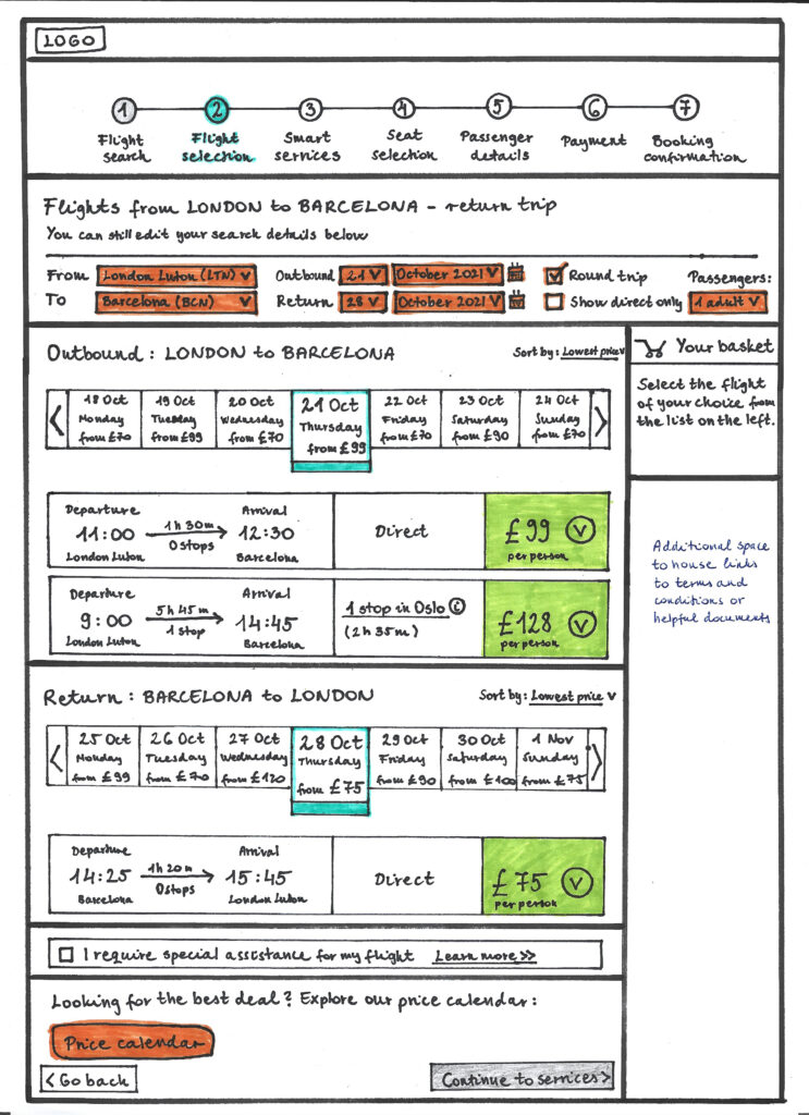
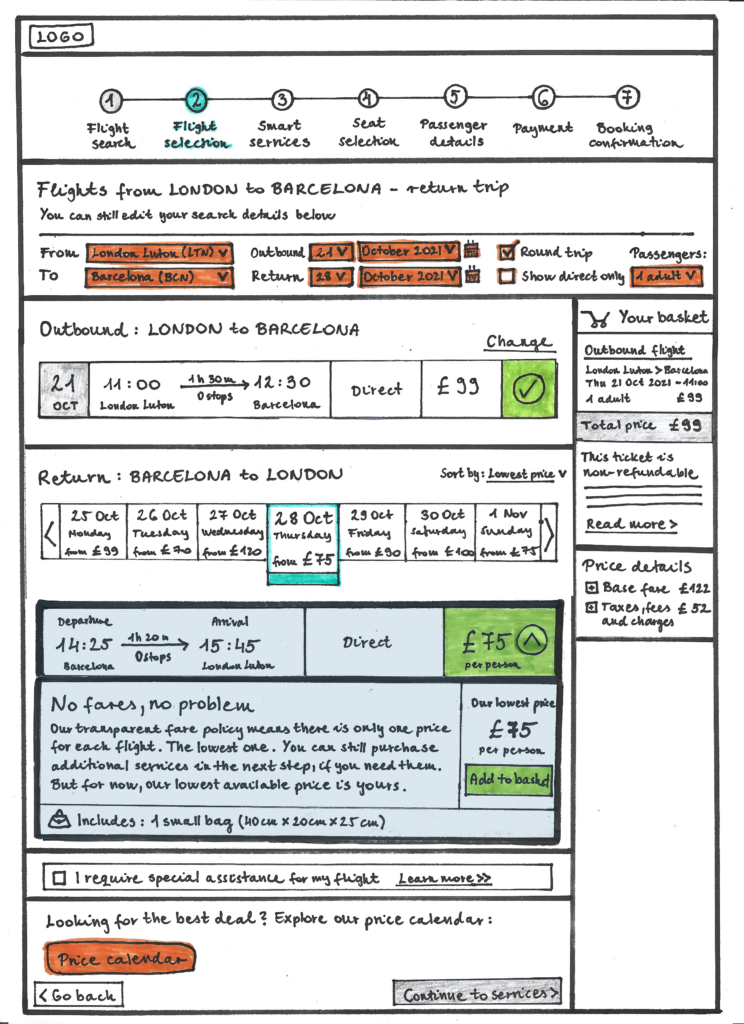
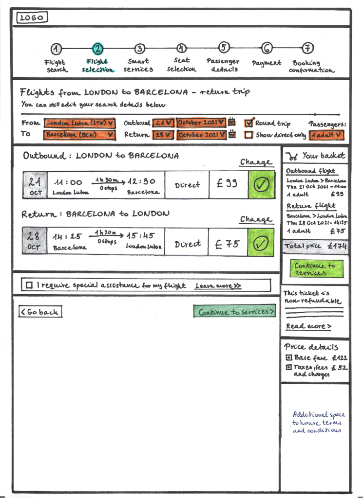
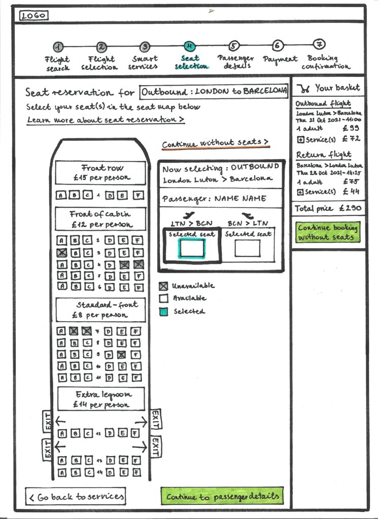
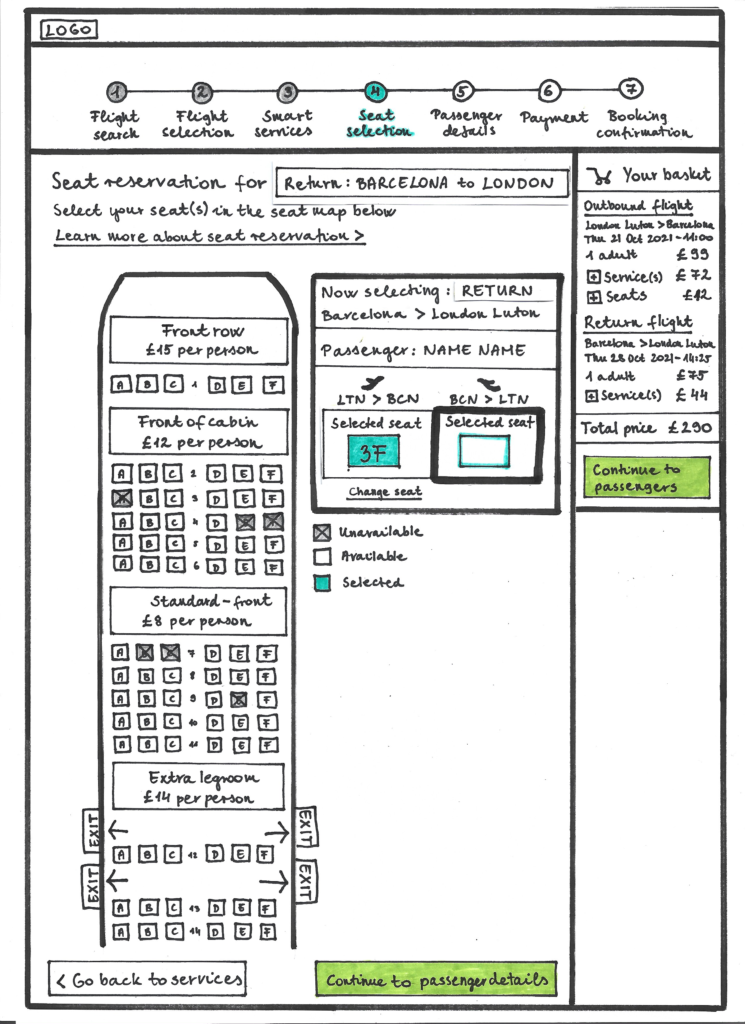
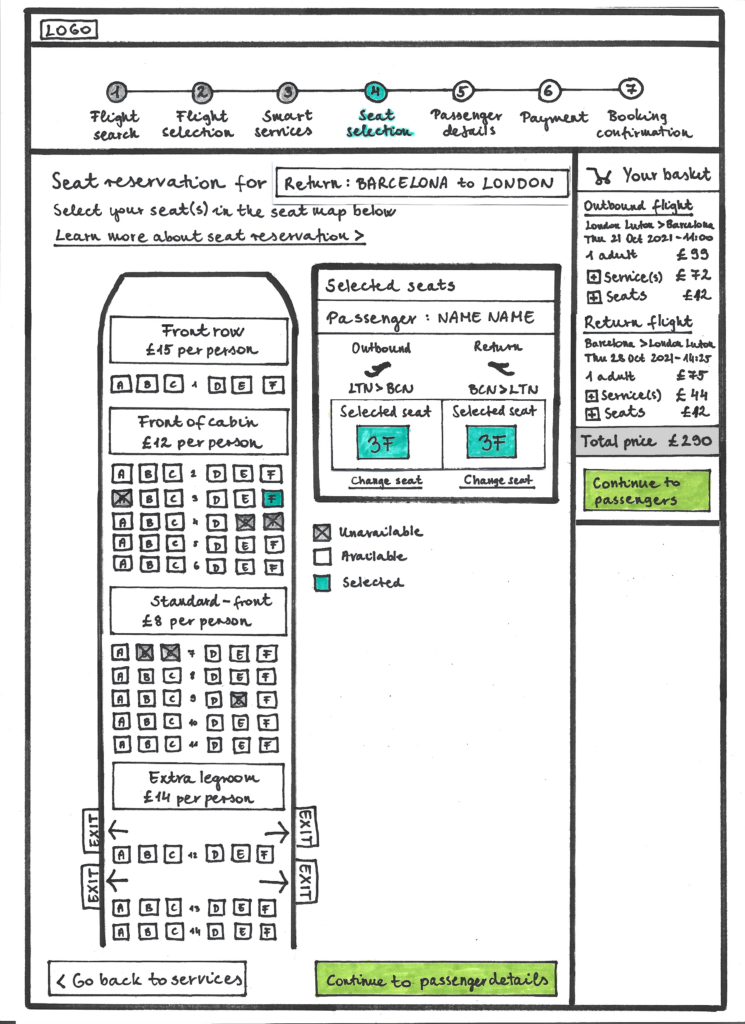
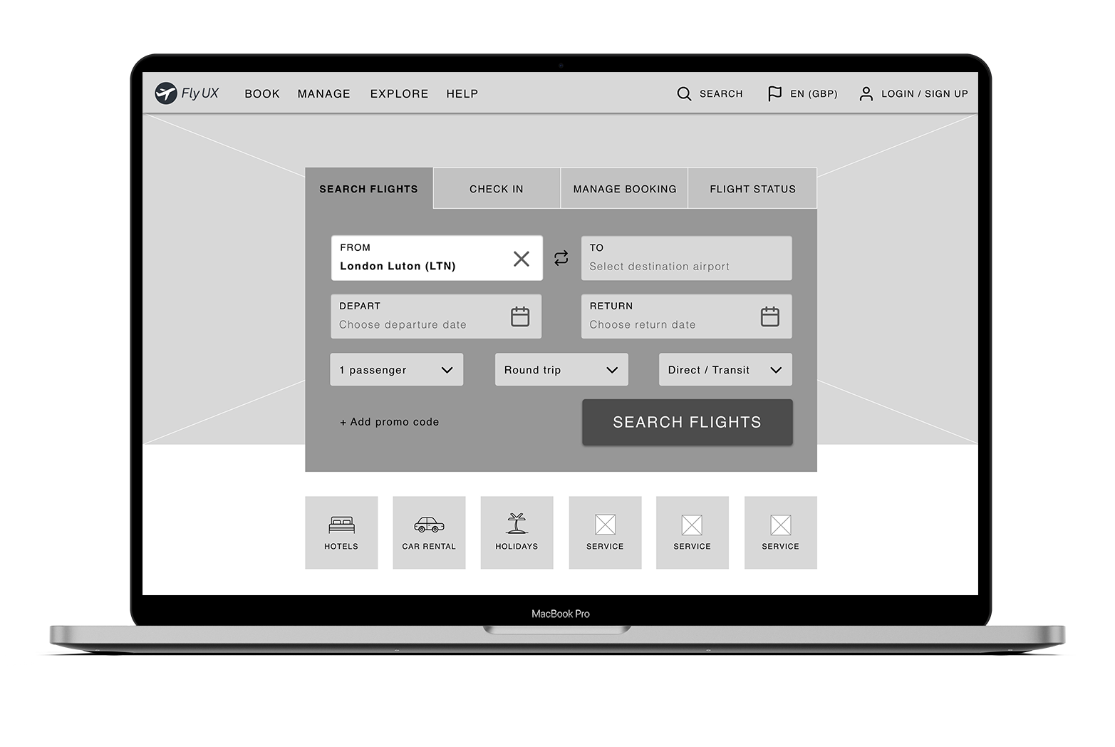
With the primary user flow defined,
I started to capture my ideas by
sketching low-fidelity screens
using pen and paper.
Medium-fidelity prototype
Bringing the ideas to life

Once I had a visual direction for the website layout, I started to add more details and precisions to the sketches by turning them into mid-fidelity screens. On these screens, I included elements that directly address user goals, needs, frustrations, while incorporating common design patterns seen on other airline websites.

Homepage & Flight search tool

Based on my research, the primary use cases on an airline website are: researching prices, booking a flight and online check-in. I designed a prominent tool in the header section that allows users to access these functions immediately. All other services that are not related to flights, such as hotels and holiday bookings, live under this section to avoid confusion. Instead of mixing dropdown and checkbox features within the flight search tool, I chose a consistent, dropdown-only layout for all input fields to streamline the search process.

Selecting a flight

As users land on the search result page, they are presented with a progress bar to manage their expectations. They also have the option to instantly change their initial search details, as one of the pain points uncovered during the initial user research was not being able to modify the search without restarting the process.

By default, flights are sorted by lowest price to accommodate the primary user goal. Any flight on this page can be added to the basket by a simple click on the “Add to basket button”. I’m hoping this could help eliminate the struggle some users had during testing, and provide a more straightforward flight selection experience.

As mentioned before, fare selection is completely removed from the process, but there is a small explanatory text box, in case some users are looking for this convention.

Selecting services

Being bombarded with additional services can arguably be the number one user pain point in the booking experience. Airlines need to sell these services but they could do so in a less intrusive way, while answering the main question on users’ mind: what’s in it for me?

To replace the initial fare selection process, I designed and placed three service bundles at this later stage of the booking process. They are essentially the same offerings but presented in a more desirable way, clearly stating why users should consider purchasing them now. Instead of vague titles, such as “Flexi Plus”, I used a more emotive naming convention that helps users identify with the packages (e.g. short trip bundle).

All individual services are grouped into three main categories below the bundles, to avoid clutter and an overwhelming amount of advertising on this page. There is room for compromise here if the airline insists on displaying a couple of promotional banners, but for now, I kept it as user-centered as possible.

Selecting seats

When it comes to selecting a seat, the key user pain points were not being able to tell if they are looking at the outbound or the return selection, as well as struggling to find an option to skip this step altogether.

To resolve these, I designed a clear tool where users can see both selections together and included prominent titles stating the current selection’s nature. I have also created multiple easy-to-find functions that allow them to skip this step.

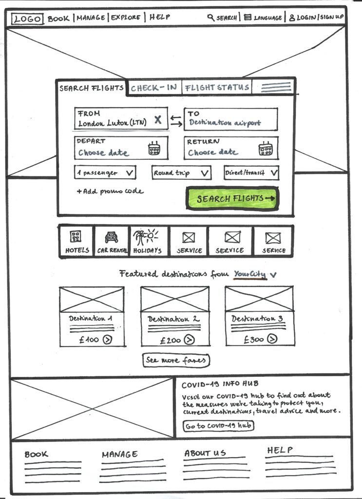
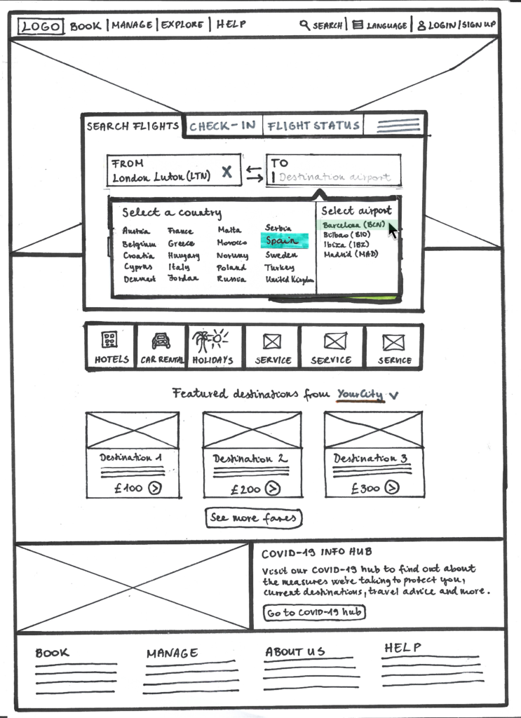
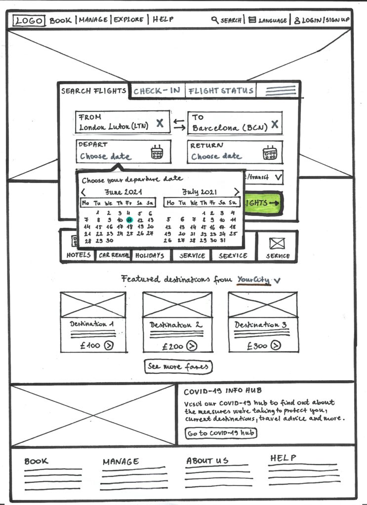
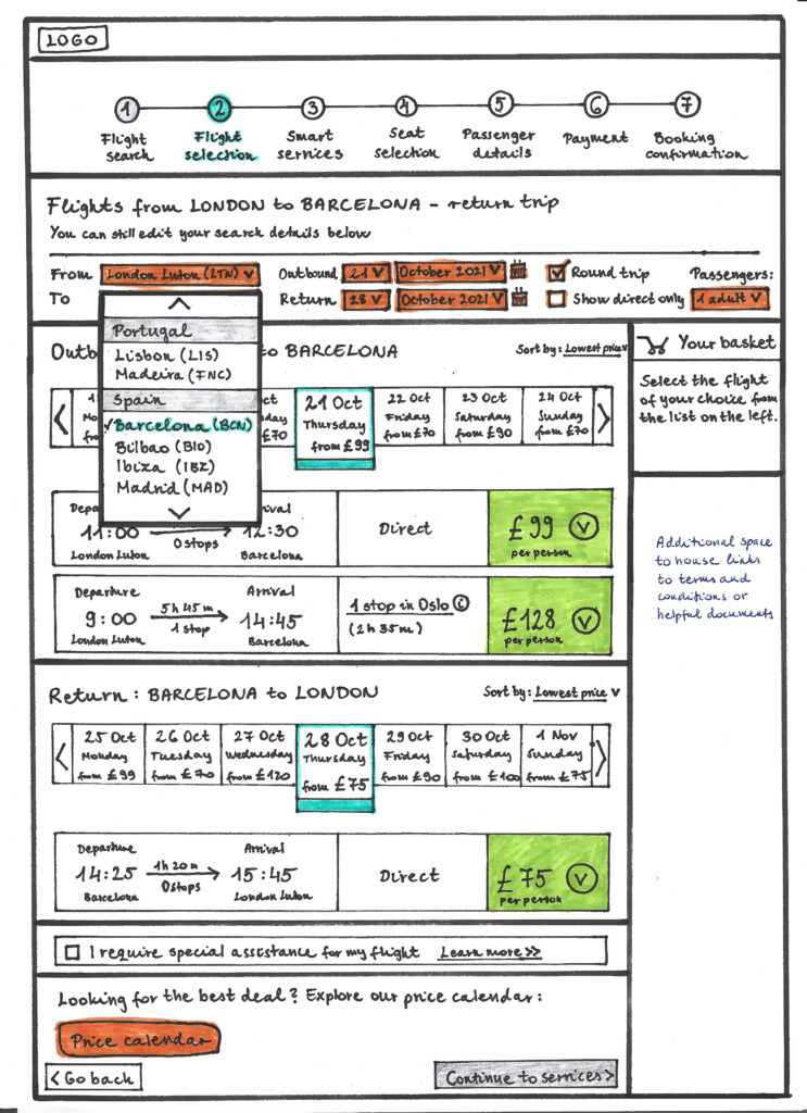
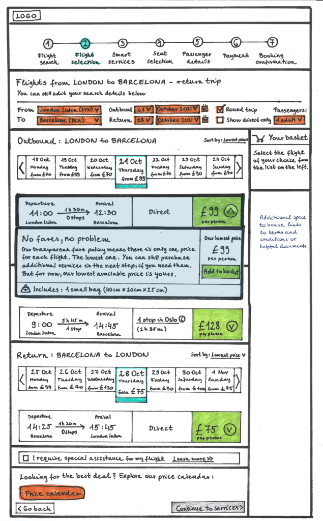
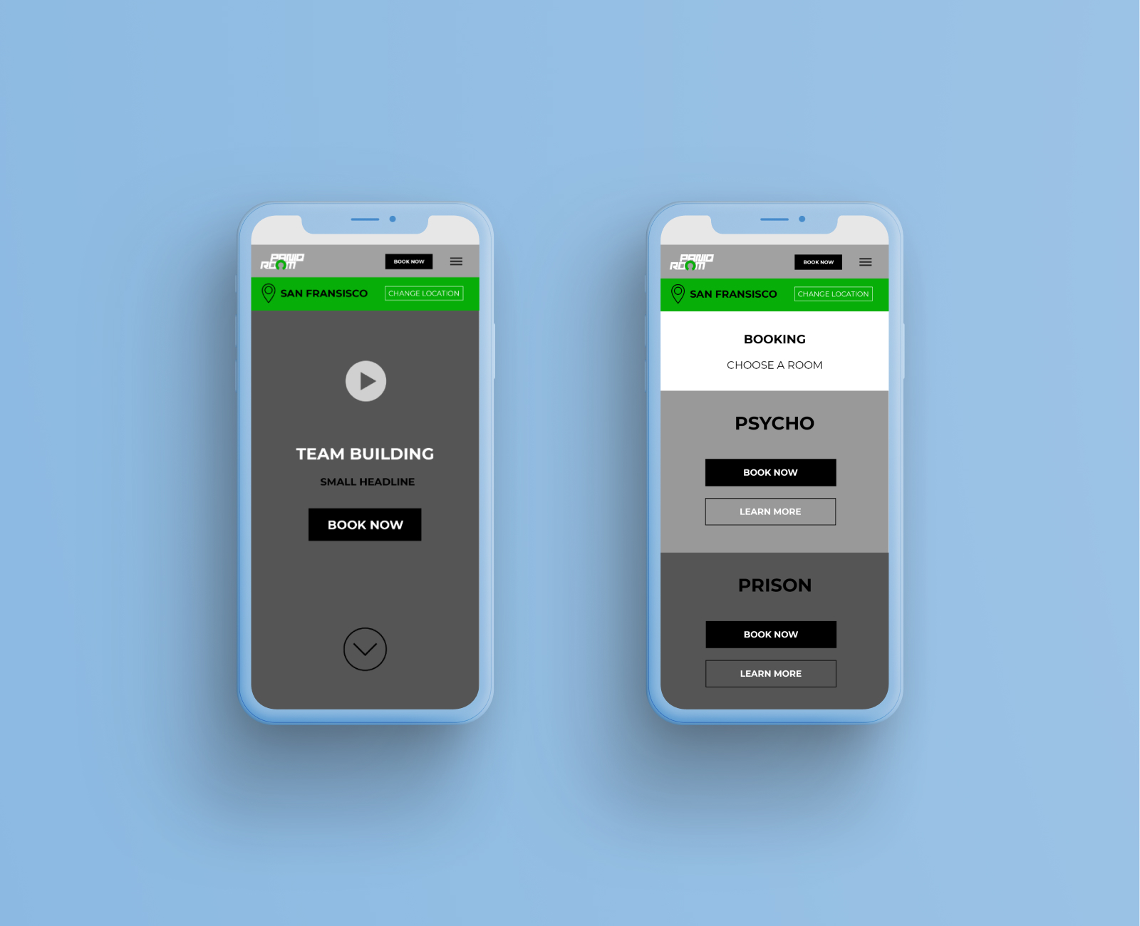
Click the image below to see
the latest prototype in action
Usability testing
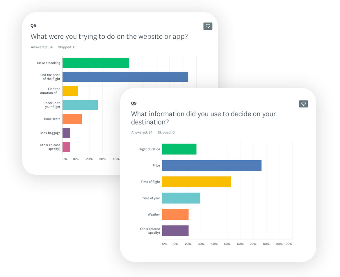
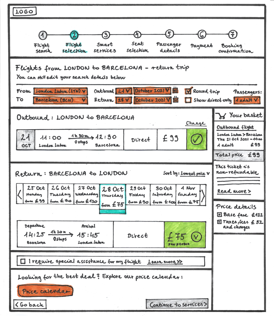
Initial feedback from my usability tests

Following multiple usability tests, I can confirm that all users reacted positively to the prototype journey. They described it as a “very natural, familiar flow” which “felt similar to the experience of purchasing train tickets.” They appreciated “the simplicity of selecting flights” and described the service bundles as “good deals that I would consider buying”. It’s important to note that the service bundles were exact replicates of existing fare types on airline websites and the same users have shown no interest in purchasing them during the initial usability tests.

Wireframes
As part of the project, I was also
tasked to develop wireframes for
each screen in my prototype
SUMMARY
Conclusions & Next steps

Saying that I really enjoyed working on this project would be an understatement. Essentially, it made me want to leave my current Group Strategy Director role to become a full-time UX Designer.

My key takeaway was that no matter how hard you’re trying to adhere to existing conventions, sometimes they’re just not right. Trust the research process, listen to your users and don’t be afraid to take the leap if necessary. But don’t get offended either if some of your ideas are not the right solutions to the problem.

Following the usability tests on my prototype, I’ve made many minor changes based on the participants’ comments. This really helped me fine-tune my designs, and if there was more time, I would conduct a series of further usability tests to make sure I’ve got it right. Apart from that, the next step for this project is to design and test the currently missing steps of the prototype (passenger details, payment, confirmation), then create a design system and design the UI of each screen on the website.